Make your site look great on any device. This Responsive Web Design primer gives you mobile-first strategies, media query patterns, and practical code so you can start building flexible sites today.

Introduction
Responsive Web Design is the practice of building pages that adapt to different screens and contexts. In this guide you’ll learn mobile-first techniques, CSS media queries, fluid grids, responsive images, and performance tips so sites work well on phones, tablets, and desktops. Importantly, you’ll also find practical examples and checklists to apply right away.
What is Responsive Web Design?
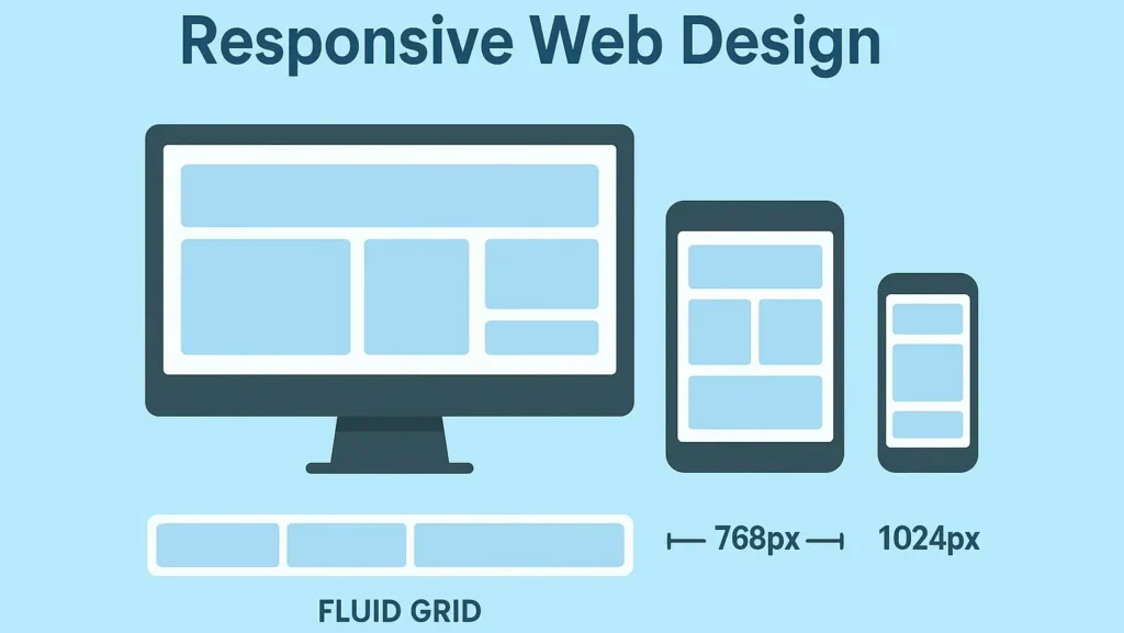
Responsive Web Design (RWD) uses flexible layouts, fluid images, and CSS media queries to make a single site behave correctly across many viewport sizes. Rather than maintaining separate sites, RWD adapts the same content to the available space so users get a consistent experience. In short, it saves time and improves UX.
Why it matters
First, it improves usability and conversions on mobile. Moreover, it affects SEO: search engines favor mobile-friendly pages. Finally, it reduces maintenance because one codebase serves all devices. Therefore, investing in responsive design pays off across metrics.
Core Principles (Mobile-First)
Start with the smallest viewport and progressively enhance. Mobile-first design helps performance and places content priority on constrained screens.
- Mobile-first CSS: write base styles for phones, then add
min-widthmedia queries. - Fluid layout: use
%,vw,remand flexible grid systems. - Responsive media: images and video scale within containers.
- Logical breakpoints: set breakpoints where the layout actually needs change, not at device-specific widths.
By designing this way, you build from constraints outward. Consequently, your pages are lean and faster.
CSS Media Queries — Practical Patterns
Media queries are the RWD workhorse. Use min-width queries for mobile-first flows, and then enhance progressively.
/* Base — mobile first */
.container { padding: 1rem; }

/* Tablet and up */
@media (min-width: 768px) {
  .container { padding: 2rem; }
}

/* Desktop */
@media (min-width: 1200px) {
  .container { max-width: 1100px; margin: 0 auto; }
}
In addition, prefer ranges that match content needs. For example, you might use em or rem-based breakpoints when your layout should react to font scaling. Likewise, test breakpoints in the browser and adjust them where the content breaks, not where a device name implies.
Fluid Grids: Flexbox and CSS Grid
Use CSS Grid for two-dimensional layouts and Flexbox for linear flows. Together, they cover most responsive scenarios.
Two-column grid → single column on mobile
.grid {
  display: grid;
  grid-template-columns: 1fr;
  gap: 1rem;
}

@media (min-width: 900px) {
  .grid { grid-template-columns: 2fr 1fr; }
}
Flexbox card row that wraps
.row { display:flex; flex-wrap:wrap; gap:1rem; }
.card { flex:1 1 240px; min-width:220px; }
Because flex items can wrap and grid can define explicit areas, these tools give predictable reflow and preserve accessible source order. Therefore, use grid for main layout scaffolding and flexbox for UI components like buttons and card rows.
Units and Typography
Avoid fixed px everywhere. Instead, choose units that scale well.
- Use
remfor consistent, scalable typography. - Use
%,fr, andvwfor layout and responsive sizing. - Clamp sizes:
font-size: clamp(1rem, 2.2vw, 1.2rem);keeps fluid typographic scale.
Also increase line-height on smaller screens for legibility. For example, line-height: 1.5 improves readability on phones. Meanwhile, letter-spacing can stay tighter on larger viewports.
Responsive Images & Art Direction
Serve correct image sizes with srcset and sizes. For art direction, use <picture>.
<picture>
  <source media="(min-width:1200px)" srcset="hero-large.jpg">
  <source media="(min-width:600px)" srcset="hero-medium.jpg">
  <img src="hero-small.jpg" alt="Responsive Web Design hero image" style="width:100%;height:auto;">
</picture>
Always add max-width:100% and height:auto in CSS to prevent overflow. Furthermore, prefer modern formats (WebP/AVIF) when available. This reduces bytes while preserving quality, and consequently speeds up loads on mobile.
Art Direction vs. Scaling
Sometimes you want a different crop for mobile. In that case, use the <picture> approach or serve multiple crops. This way, you optimize the composition for context. For instance, a hero image might show a wide scene on desktop, but a centered crop on mobile.
Navigation and Touch UX
Design navigation that works on touch. Use off-canvas menus, accessible toggles, or stacked links for small screens. Also:
- Make touch targets at least 44×44 CSS pixels.
- Use visible focus styles and avoid hover-only interactions.
- Implement
aria-expandedon menu buttons for screen readers.
In short, ensure both touch and keyboard users can navigate.
Performance & Progressive Enhancement
Performance is central to responsive design. Consequently, adopt progressive enhancement: deliver the core experience first, then layer on non-essential features.
- Critical CSS: inline above-the-fold rules for first paint.
- Lazy load images:
loading="lazy"for non-hero images. - Defer JS: defer or async non-critical scripts.
- Modern image formats: serve WebP/AVIF when possible.
Moreover, reduce third-party scripts. They often cause layout shifts and latency. Thus, audit dependencies and only include those that matter.
Accessibility Considerations
Accessibility and responsiveness go together. Therefore, verify:
- Sufficient color contrast on all breakpoints.
- Logical DOM order that matches reading order.
- Keyboard operability for toggles and menus.
- Clear focus indicators and ARIA where appropriate.
For instance, ensure a modal dialog traps focus and scales elegantly on small viewports. Also, label form fields descriptively and make touch targets roomy.
Testing & Debugging
Test across sizes and conditions. Use these tools and practices:
- DevTools Device Mode for viewport emulation.
- Network throttling to simulate slow connections.
- Lighthouse or PageSpeed Insights for performance audits.
- Real device testing, especially on mid-range phones.
Additionally, test orientation changes, font scaling, and pinch-zoom. These often reveal layout edge cases. If a layout breaks, add a targeted breakpoint or tweak the component’s max-width.
Responsive Web Design Checklist (copy for your project)
- Start mobile-first: base styles for small screens.
- Choose fluid units and clamp typography.
- Implement breakpoints where layout breaks, not by device.
- Make images responsive (
srcset+picture). - Optimize performance (lazy images, critical CSS).
- Improve touch UX and accessibility.
- Test on real devices and with emulators.
Use this checklist as an actionable plan. Then iterate based on analytics and device breakpoints in your traffic.
Practical Example: Transform a Header
Below is a short example that turns a stacked header into a horizontal header on wider screens. First apply basic mobile styles, then enhance.
<header class="site-header">
  <div class="brand">My Site</div>
  <nav class="main-nav"> ... </nav>
</header>
.site-header { display:block; padding:1rem; }
.brand { font-size:1.2rem; margin-bottom:.5rem; }
.main-nav { display:block; }

@media (min-width:900px) {
  .site-header { display:flex; justify-content:space-between; align-items:center; }
  .brand { margin-bottom:0; }
  .main-nav { display:flex; gap:1rem; }
}
This transformation is simple, predictable, and therefore robust across devices.
Conclusion & Call to Action
You now have a practical Responsive Web Design playbook: mobile-first CSS, fluid grids, responsive images, and performance tactics to make sites mobile-friendly. Start by refactoring one page with the checklist above. Then measure results and refine.


