Ah, the allure of the command line! Today, we’re diving deep into creating a stunning Retro Terminal UI using just HTML and CSS. If you’ve ever felt a pang of nostalgia for those classic green-on-black screens, or perhaps the amber glow of an old CRT monitor, then this tutorial is for you. We’ll craft a beautiful, functional terminal interface that evokes that vintage computing vibe, complete with blinking cursors and scanline effects. Moreover, this project offers a fantastic way to learn practical CSS techniques like box-shadow for glows, animation for interactivity, and ::before pseudo-elements for advanced visuals. Get ready to power up your frontend skills and build something truly unique!
What We Are Building: A Blast from the Past
Remember those old computers? Before graphical user interfaces became dominant, developers and users alike interacted with machines through the stark, elegant simplicity of the command line. This terminal-style interface isn’t just a relic; it’s a powerful aesthetic. You’ve probably seen it trending in modern web designs, often used for personal portfolios, interactive storytelling, or even game interfaces. It adds a sophisticated, tech-savvy touch that instantly communicates a sense of purpose and history.
The beauty of a Retro Terminal UI lies in its minimalist appeal and immediate recognition. It instantly conveys a “hacker” or “developer” aesthetic, making it perfect for portfolio sites, documentation portals, or even login screens that demand attention. Imagine a product launch site featuring a terminal that “boots up” with key information. Or perhaps a developer’s blog where navigation feels like typing commands. It’s a fantastic way to blend functionality with a compelling, nostalgic user experience. We are creating a static visual component today, but its potential for dynamic interaction is immense.
HTML Structure: Laying the Foundation
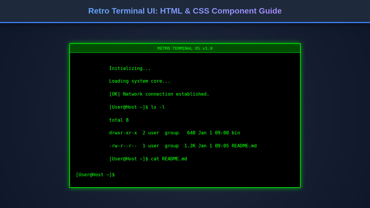
Our terminal needs a solid backbone, and HTML is perfect for this. We’ll define a main container, a header with those iconic control buttons and title, and a body to house our “command lines” and the interactive prompt. This structure is semantic and straightforward, making it easy to style later.
<div class="terminal-container">
    <div class="terminal-header">
        <div class="terminal-buttons">
            <span class="terminal-button red"></span>
            <span class="terminal-button yellow"></span>
            <span class="terminal-button green"></span>
        </div>
        <div class="terminal-title">user@my-machine: ~</div>
    </div>
    <div class="terminal-body">
        <div class="terminal-line">Welcome to the Retro Terminal!</div>
        <div class="terminal-line">Type 'help' for available commands.</div>
        <div class="terminal-line input-line">
            <span class="prompt">guest@machine:~ $</span>
            <span class="cursor"></span>
        </div>
    </div>
</div>
CSS Styling: Bringing the Pixels to Life
Now for the fun part: CSS! This is where we inject that nostalgic glow, the monospace fonts, and the iconic green-on-black theme. We’ll tackle everything from the overall container’s appearance to the subtle animations of the blinking cursor and even simulated CRT scanlines.
@import url('https://fonts.googleapis.com/css2?family=VT323&display=swap');

body {
    background-color: #333;
    display: flex;
    justify-content: center;
    align-items: center;
    min-height: 100vh;
    margin: 0;
    font-family: 'VT323', monospace;
    overflow: hidden;
}

.terminal-container {
    width: 90%;
    max-width: 800px;
    height: 500px;
    background-color: #1a1a1a;
    border-radius: 8px;
    box-shadow: 0 0 15px rgba(0, 255, 0, 0.7),
                inset 0 0 10px rgba(0, 255, 0, 0.5);
    border: 2px solid #0f0;
    display: flex;
    flex-direction: column;
    overflow: hidden;
    position: relative;
    padding: 15px;
    box-sizing: border-box;
}

.terminal-header {
    display: flex;
    align-items: center;
    padding-bottom: 10px;
    border-bottom: 1px solid rgba(0, 255, 0, 0.3);
    margin-bottom: 10px;
}

.terminal-buttons {
    display: flex;
    gap: 8px;
}

.terminal-button {
    width: 12px;
    height: 12px;
    border-radius: 50%;
    display: inline-block;
}
.terminal-button.red { background-color: #ff5f56; }
.terminal-button.yellow { background-color: #ffbd2e; }
.terminal-button.green { background-color: #27c93f; }

.terminal-title {
    flex-grow: 1;
    text-align: center;
    color: #0f0;
    font-size: 0.9em;
    text-shadow: 0 0 5px #0f0;
}

.terminal-body {
    flex-grow: 1;
    color: #0f0;
    font-size: 1.1em;
    line-height: 1.4;
    overflow-y: auto;
    padding-right: 10px;
    text-shadow: 0 0 3px #0f0;
}

.terminal-body::-webkit-scrollbar {
    width: 8px;
}
.terminal-body::-webkit-scrollbar-thumb {
    background-color: rgba(0, 255, 0, 0.5);
    border-radius: 4px;
}
.terminal-body::-webkit-scrollbar-track {
    background-color: #1a1a1a;
}

.terminal-line {
    margin-bottom: 5px;
}

.input-line {
    display: flex;
    align-items: baseline;
    margin-top: 10px;
}

.prompt {
    color: #0f0;
    margin-right: 8px;
}

.cursor {
    display: inline-block;
    width: 8px;
    height: 1.2em;
    background-color: #0f0;
    animation: blink 1s step-end infinite;
}

@keyframes blink {
    from, to { background-color: transparent; }
    50% { background-color: #0f0; }
}

.terminal-container::before {
    content: '';
    position: absolute;
    top: 0;
    left: 0;
    width: 100%;
    height: 100%;
    background: linear-gradient(rgba(18, 16, 16, 0) 50%, rgba(0, 0, 0, 0.25) 50%),
                linear-gradient(90deg, rgba(255, 0, 0, 0.06), rgba(0, 255, 0, 0.02), rgba(0, 0, 255, 0.06));
    background-size: 100% 2px, 3px 100%;
    pointer-events: none;
    opacity: 0.1;
}
Step-by-Step Breakdown: Unpacking the Magic
Let’s dissect the code and understand how each piece contributes to our beautiful retro terminal. We’ll explore the key styling decisions that make this component truly shine.
The Terminal Container and General Aesthetics
First, we set up our body to center the terminal. Then, the .terminal-container gets its signature look. It has a dark background (#1a1a1a), a green border (#0f0), and crucially, box-shadow properties that create a glowing effect. The outer shadow casts a soft green light, while the inset shadow gives an internal luminosity, truly making it feel alive. This combination immediately screams “power on!” We use border-radius for slightly rounded corners, mimicking older monitors and adding to the authentic retro feel. Pay close attention to these subtle yet powerful styling choices. For more unique card designs, you might enjoy this guide on creating unique web components.
The terminal environment, despite its age, represents a powerful paradigm of direct interaction with a computing system. Recreating its aesthetic isn’t just about nostalgia; it’s about appreciating functional design.
Header and Control Buttons
The .terminal-header uses Flexbox to align its contents beautifully. It features three <span> elements, each styled as a small, colored circle: red, yellow, and green. These are purely aesthetic, representing the close, minimize, and maximize buttons common in graphical interfaces, but here they add a delightful touch of realism to our vintage terminal. The terminal-title centrally displays a user prompt, giving context to our UI. We apply a subtle text-shadow here to enhance that glowing, pixelated feel.
The Terminal Body and Text Display
The .terminal-body is where all the action happens. It also uses flex-grow: 1 to occupy available vertical space. Crucially, overflow-y: auto ensures that if our output exceeds the terminal’s height, a scrollbar appears, just like a real terminal. We use the VT323 Google Font, a fantastic choice for replicating that pixelated, monospace character common on older screens. It’s truly transformative! We also add text-shadow to give the text itself a slight bloom. For other interesting text effects, consider exploring a glitch text effect to add more dynamic flair to your headings.
The Blinking Cursor and Input Prompt
Every good terminal needs an interactive prompt. Our .input-line combines a static prompt text and a dynamic cursor. The cursor is simply a <span> element with a background-color matching our terminal’s text. The magic lies in the blink CSS animation. This keyframes animation toggles the cursor’s background-color between transparent and the glowy green every second, creating that iconic blinking effect. It’s a small detail, but it makes a huge difference in conveying interactivity, even in a static display. Check out more on CSS animations and keyframes on MDN Web Docs.
The CRT Scanline Effect
To push the retro vibe even further, we use a ::before pseudo-element on the .terminal-container. This ingenious overlay creates a subtle yet powerful scanline effect, a hallmark of vintage CRT displays. We achieve this with two linear-gradient backgrounds. The first one meticulously crafts horizontal lines (50% transparent, 50% dark), while the second introduces faint vertical lines with a slight RGB chromatic aberration effect, mimicking screen imperfections. This overlay sits gracefully on top of the terminal content with a low opacity, brilliantly giving the illusion of an authentic CRT screen. This technique truly demonstrates advanced CSS capabilities and a keen eye for visual detail. Interested in performance for CSS effects? Look into CSS-Tricks for animation tips.
Embracing CSS pseudo-elements for visual effects, like our scanlines, showcases how much creative power modern CSS truly wields. It’s a testament to the language’s evolution beyond basic styling.
Making It Responsive: Adapting to Any Screen
A good web component works everywhere, and our terminal is no exception. We ensure responsiveness using media queries. The initial width: 90% and max-width: 800px on .terminal-container already provide a flexible base. However, for smaller screens, we can make further adjustments.
@media (max-width: 768px) {
    .terminal-container {
        width: 95%; /* Make it slightly wider on small screens */
        height: 400px; /* Reduce height for mobile */
        padding: 10px;
    }
    .terminal-title {
        font-size: 0.8em; /* Smaller title */
    }
    .terminal-body {
        font-size: 1em; /* Adjust body font size */
        padding-right: 5px; /* Adjust scrollbar padding */
    }
    .terminal-buttons {
        gap: 6px; /* Smaller button gap */
    }
    .terminal-button {
        width: 10px;
        height: 10px; /* Smaller buttons */
    }
}
By reducing the height, padding, font-size, and button sizes within the media query, we optimize the layout for mobile devices. This ensures a great user experience whether someone is viewing your amazing Retro Terminal UI on a desktop monitor or a smartphone. Maintaining visual appeal across devices is key for modern web development. For more sophisticated loading states in responsive designs, consider learning about a skeleton loader animation to enhance user perception.
Final Output: The Retro Dream Achieved
You’ve built it! With a relatively small amount of HTML and CSS, we’ve successfully brought a classic aesthetic to life. You now have a fully styled Retro Terminal UI that glows with nostalgia. The carefully chosen font, the vibrant green color palette, the subtly animated cursor, and those fantastic scanlines all come together to create an immersive, vintage computing experience. Every detail contributes to the overall authenticity, transporting users back to an era of command-line prowess.
The visual fidelity is quite remarkable. You can almost hear the hum of an old CRT as you gaze upon your creation. This component isn’t just functional; it’s a piece of interactive art, demonstrating how powerful and expressive modern web technologies can be. Take a moment to appreciate the journey from a simple div to this captivating interface.
Conclusion: Your Terminal Awaits!
What a journey, right? We’ve crafted a beautiful Retro Terminal UI from scratch, leveraging the simplicity of HTML for structure and the power of CSS for breathtaking visuals. You now possess the skills to create a compelling, nostalgic interface that stands out. This component isn’t just a static display; it’s a gateway to creativity. Imagine integrating JavaScript to make it truly interactive, processing commands, or displaying dynamic content.
Where can you apply this? Think developer portfolios, engaging “About Me” sections, interactive documentation, or even unique error pages. This retro terminal UI provides an instant branding statement, signaling a keen eye for detail and a love for classic computing. Keep experimenting, keep building, and let that retro charm shine in your projects!