Pagination Design is an essential component for many web applications. It helps users navigate through large datasets, making content manageable and easily accessible. Imagine a blog with hundreds of posts, or an e-commerce site with thousands of products! Without pagination, these sites would be incredibly clunky and frustrating to use. This guide will walk you through building a sleek, responsive pagination component using fundamental web technologies.
What We Are Building
We’re diving into creating a modern pagination component. This design often draws inspiration from popular UI frameworks, offering a clean, intuitive look. Such components are definitely trending; users expect seamless navigation, not endless scrolling. Furthermore, effective pagination improves page load times by fetching only necessary content.
You might find this component invaluable in various scenarios. Think about your blog archive, a search results page, or even a detailed data table. Anywhere you display a list of items that could grow extensively benefits from proper navigation. We will implement ‘Previous’ and ‘Next’ buttons, along with dynamic page numbers. This setup ensures users can easily jump between pages or increment through them one by one. Consequently, this enhances overall user experience.
“Good design is about making something intelligible and memorable. Pagination, when done right, makes data exploration a breeze.”
HTML Structure for Your Pagination Design
Our HTML serves as the skeleton of the pagination component. We’ll use semantic tags to ensure accessibility and maintainability. A navigation element will wrap our list of page items. This structure provides a clear, logical grouping for our pagination controls.
<nav class="pagination-container" aria-label="Page navigation">
<ul class="pagination">
<li class="page-item prev disabled">
<a href="#" class="page-link" aria-label="Previous">
<span aria-hidden="true">«</span>
</a>
</li>
<!-- Page numbers will be injected here by JavaScript -->
<li class="page-item next">
<a href="#" class="page-link" aria-label="Next">
<span aria-hidden="true">»</span>
</a>
</li>
</ul>
</nav>
<!-- This div is for demonstrating content changes -->
<div id="content-area" style="text-align: center; margin-top: 20px; font-size: 1.2em; color: #333;">Content for Page 1</div>CSS Styling for an Engaging Pagination Design
Next, we apply CSS to transform our basic HTML into an attractive, functional component. We’ll style the container, individual page items, and the links within them. This ensures a consistent and appealing look across all states, including active and disabled pages. We focus on modern, clean aesthetics.
.pagination-container {
    display: flex;
    justify-content: center;
    margin: 2rem 0;
    font-family: 'Segoe UI', Tahoma, Geneva, Verdana, sans-serif;
}

.pagination {
    display: flex;
    list-style: none;
    padding: 0;
    margin: 0;
    border-radius: 0.25rem;
    box-shadow: 0 4px 10px rgba(0, 0, 0, 0.1);
    overflow: hidden; /* Ensures rounded corners are applied correctly */
}

.page-item {
    margin: 0;
}

.page-link {
    display: block;
    padding: 0.75rem 1.1rem;
    color: #007bff;
    text-decoration: none;
    border: 1px solid #dee2e6;
    background-color: #fff;
    transition: all 0.2s ease-in-out;
    font-size: 1rem;
    line-height: 1.5;
}

.page-item:first-child .page-link {
    border-top-left-radius: 0.25rem;
    border-bottom-left-radius: 0.25rem;
}

.page-item:last-child .page-link {
    border-top-right-radius: 0.25rem;
    border-bottom-right-radius: 0.25rem;
}

.page-item:not(:first-child) .page-link {
    margin-left: -1px; /* Overlap borders for a continuous look */
}

.page-link:hover:not(.disabled .page-link) {
    background-color: #e9ecef;
    border-color: #0056b3;
    color: #0056b3;
    cursor: pointer;
}

.page-item.active .page-link {
    background-color: #007bff;
    border-color: #007bff;
    color: #fff;
    pointer-events: none; /* Prevent clicking the active page */
}

.page-item.disabled .page-link {
    color: #6c757d;
    pointer-events: none;
    background-color: #f8f9fa;
    border-color: #dee2e6;
    cursor: not-allowed;
}

.page-item.disabled .page-link:hover {
    background-color: #f8f9fa;
    border-color: #dee2e6;
}

/* Styling for the ellipsis */
.page-item.disabled .page-link span {
    /* specific styling if ellipsis is a span */
}

/* Keep a consistent height for ellipsis to align with numbers */
.page-item.disabled .page-link.ellipsis {
    padding-top: 0.75rem;
    padding-bottom: 0.75rem;
}
Step-by-Step Breakdown: How the Pagination Works
Let’s dissect the code. This will clarify how HTML, CSS, and JavaScript collaborate to form our dynamic pagination. We’ll examine each part’s role. Understanding these interactions is key to customizing your component effectively.
HTML: The Semantic Foundation
Our HTML provides a robust base. The <nav> element with aria-label="Page navigation" ensures accessibility. Screen readers can easily identify this as a navigation area. Inside, an unordered list <ul class="pagination"> holds individual page items. Each <li class="page-item"> represents a page, a ‘Previous’ button, or a ‘Next’ button. Anchor tags <a class="page-link"> make each item clickable. The disabled class on list items and the active class are initially set for demonstration. JavaScript will manage these dynamically. This semantic structure is crucial for any effective web component design.
CSS: Visual Appeal and Clarity
CSS brings our pagination to life. We center the .pagination-container using flexbox for good alignment. The .pagination list receives a subtle box-shadow and rounded corners, giving it a modern card-like appearance. Each .page-link is styled as a block, with padding and borders. We use margin-left: -1px; on subsequent links. This creates a continuous, connected look by overlapping borders slightly. Hover effects provide visual feedback, changing background and text color. The .active class gives the current page a distinct look with a primary color background. Importantly, pointer-events: none; on active and disabled links prevents unintended clicks. This makes the UI intuitive and prevents errors. For further styling insights, check out resources like CSS-Tricks.
JavaScript: The Interactive Brain
JavaScript is where the magic happens. It generates page numbers dynamically and handles user interaction. The createPagination function takes totalPages and currentPage as arguments. It first clears any existing pagination. Then, it constructs ‘Previous’ and ‘Next’ buttons, adding `disabled` classes as needed. A key part of the JavaScript is managing the display of page numbers. When there are many pages (e.g., more than 7), we implement an ellipsis logic. This shows only a subset of pages around the currentPage (e.g., ‘1… 5 6 7 8 9 …20′). This approach keeps the pagination compact and usable, especially with hundreds of pages. Event listeners are attached to each link. When clicked, they call setCurrentPage, which updates our activePage variable and re-renders the pagination. This ensures the correct page is highlighted and the content updates. Consider implementing robust JavaScript code review practices for complex interactions.
“JavaScript isn’t just about making things move; it’s about making user interfaces intelligent and responsive to user needs.”
The displayPageContent function is a placeholder. In a real-world application, this function would fetch data for the selected page. For instance, it might make an AJAX call or filter a local dataset. We call setCurrentPage(activePage); on DOMContentLoaded. This initializes the pagination and displays content for the first page when the page loads. This dynamic generation makes our component flexible and reusable. If you’re handling large datasets, this client-side manipulation can be combined with server-side data extraction for optimal performance.
// Function to create pagination dynamically
function createPagination(totalPages, currentPage) {
const paginationElement = document.querySelector(".pagination");
paginationElement.innerHTML = ''; // Clear existing pagination to rebuild it
// Add Previous button
const prevItem = document.createElement("li");
prevItem.className = `page-item prev ${currentPage === 1 ? 'disabled' : ''}`;
prevItem.innerHTML = `<a href="#" class="page-link" aria-label="Previous"><span aria-hidden="true">«</span></a>`;
prevItem.addEventListener("click", (e) => {
e.preventDefault();
if (currentPage > 1) {
setCurrentPage(currentPage - 1);
}
});
paginationElement.appendChild(prevItem);
// Logic to show a limited range of pages with ellipsis
let startPage, endPage;
const maxVisiblePages = 7; // Including current page, prev/next will handle their own states
const ellipsisThreshold = 4; // Pages around current page before showing ellipsis
if (totalPages <= maxVisiblePages) {
// Show all pages if total pages are less than or equal to maxVisiblePages
startPage = 1;
endPage = totalPages;
} else {
// Logic for showing ellipsis
if (currentPage <= ellipsisThreshold) {
startPage = 1;
endPage = maxVisiblePages - 2; // Show 1...5
} else if (currentPage > totalPages - ellipsisThreshold) {
startPage = totalPages - (maxVisiblePages - 3); // Show 16...20
endPage = totalPages;
} else {
startPage = currentPage - Math.floor(maxVisiblePages / 2) + 1; // Show 7 8 9
endPage = currentPage + Math.floor(maxVisiblePages / 2) - 1;
}
}
// Ensure startPage and endPage are within valid bounds
startPage = Math.max(1, startPage);
endPage = Math.min(totalPages, endPage);
// Add '1' and ellipsis at the beginning if necessary
if (startPage > 1) {
const firstPageItem = document.createElement("li");
firstPageItem.className = "page-item";
firstPageItem.innerHTML = `<a href="#" class="page-link">1</a>`;
firstPageItem.addEventListener("click", (e) => {
e.preventDefault();
setCurrentPage(1);
});
paginationElement.appendChild(firstPageItem);
if (startPage > 2) { // Only show ellipsis if there's a gap between 1 and startPage
const ellipsisItem = document.createElement("li");
ellipsisItem.className = "page-item disabled";
ellipsisItem.innerHTML = `<span class="page-link ellipsis">...</span>`;
paginationElement.appendChild(ellipsisItem);
}
}
// Add page numbers within the calculated range
for (let i = startPage; i <= endPage; i++) {
const pageItem = document.createElement("li");
pageItem.className = `page-item ${i === currentPage ? 'active' : ''}`;
pageItem.innerHTML = `<a href="#" class="page-link">${i}</a>`;
pageItem.addEventListener("click", (e) => {
e.preventDefault();
setCurrentPage(i);
});
paginationElement.appendChild(pageItem);
}
// Add ellipsis and 'last page' at the end if necessary
if (endPage < totalPages) {
if (endPage < totalPages - 1) { // Only show ellipsis if there's a gap between endPage and totalPages
const ellipsisItem = document.createElement("li");
ellipsisItem.className = "page-item disabled";
ellipsisItem.innerHTML = `<span class="page-link ellipsis">...</span>`;
paginationElement.appendChild(ellipsisItem);
}
const lastPageItem = document.createElement("li");
lastPageItem.className = "page-item";
lastPageItem.innerHTML = `<a href="#" class="page-link">${totalPages}</a>`;
lastPageItem.addEventListener("click", (e) => {
e.preventDefault();
setCurrentPage(totalPages);
});
paginationElement.appendChild(lastPageItem);
}
// Add Next button
const nextItem = document.createElement("li");
nextItem.className = `page-item next ${currentPage === totalPages ? 'disabled' : ''}`;
nextItem.innerHTML = `<a href="#" class="page-link" aria-label="Next"><span aria-hidden="true">»</span></a>`;
nextItem.addEventListener("click", (e) => {
e.preventDefault();
if (currentPage < totalPages) {
setCurrentPage(currentPage + 1);
}
});
paginationElement.appendChild(nextItem);
}
// Dummy function to simulate page change (in a real app, this would fetch data)
function displayPageContent(pageNumber) {
console.log(`Displaying content for page ${pageNumber}`);
const contentArea = document.getElementById('content-area');
if (contentArea) {
contentArea.innerText = `Content for Page ${pageNumber}`;
}
}
// State variable for current page and total pages
let activePage = 1;
const totalPages = 20; // Example total pages, adjust as needed
// Function to update current page and re-render pagination
function setCurrentPage(page) {
if (page > 0 && page <= totalPages) {
activePage = page;
displayPageContent(activePage); // Update content display
createPagination(totalPages, activePage); // Re-render pagination with new active page
}
}
// Initial call to create pagination and display first page when the DOM is loaded
document.addEventListener("DOMContentLoaded", () => {
setCurrentPage(activePage);
});
Making It Responsive
Responsiveness is paramount for any modern web component. Our pagination should look great on desktops, tablets, and mobile phones. We achieve this primarily through CSS media queries. The default styling assumes a larger screen. For smaller viewports, we adjust the layout and sizing.
On screens up to 768px wide, we change the .pagination to flex-wrap: wrap;. This allows the page items to flow onto multiple lines. Each .page-item becomes flexible, taking up available space. We also remove the box-shadow for a cleaner mobile look. Furthermore, we adjust padding and border-radius. This makes each page button feel like an individual, touch-friendly element. These small changes significantly improve usability on mobile devices.
For very small screens (under 480px), we further reduce font sizes and padding. This ensures the component remains compact and readable, preventing overflow issues. Mobile-first design principles guide these adjustments. We start with the smallest screen styling, then progressively enhance for larger screens. This approach provides a solid foundation. It ensures your pagination is accessible and attractive across the entire spectrum of devices.
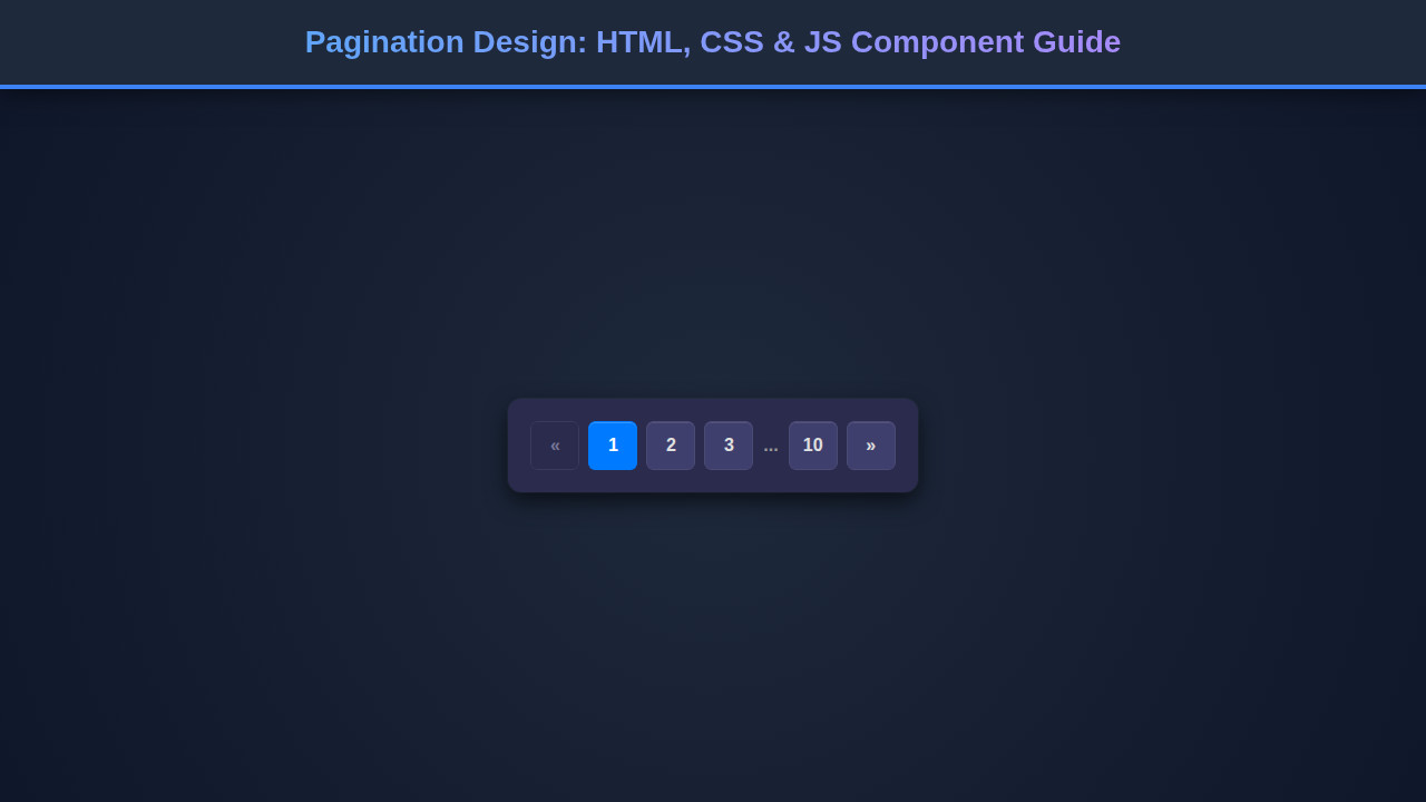
Final Output: A Refined Navigation
The result of our HTML, CSS, and JavaScript efforts is a fully functional and visually appealing pagination component. You’ll observe a horizontally centered list of page numbers. The current page stands out with a distinct background. ‘Previous’ and ‘Next’ buttons allow for incremental navigation. They disable automatically at the beginning and end of the page range. For sites with many pages, the intelligent ellipsis display keeps the pagination concise. This avoids cluttering the interface with an overwhelming number of page links. It’s a clean, user-friendly navigation system.
Conclusion
We’ve successfully built a dynamic and responsive pagination component using HTML, CSS, and JavaScript. Understanding how these core technologies integrate allows for powerful UI development. This component isn’t just about navigating pages; it’s about enhancing user experience for content-heavy sites. You can easily adapt this design for various projects. It can support anything from a simple blog to a complex data dashboard.
By implementing this component, you empower your users to effortlessly explore vast amounts of information. This fundamental web pattern improves site usability and professionalism. Now, go forth and implement amazing pagination in your next project!