In today’s fast-paced web development landscape, knowing how to create dynamic, responsive layouts is no longer a bonus—it’s a necessity. That’s where CSS grid comes in. It’s one of the most powerful layout systems available in CSS today, helping developers build responsive websites with ease, precision, and cleaner code.
If you’ve ever struggled to align elements, position components side by side, or create multi-column designs that work seamlessly across devices, CSS grid will change the game for you.
In this article, we’ll explore everything you need to know to confidently use CSS Grid, from fundamentals to real-world use cases. Whether you’re just starting out or looking to enhance your layout skills, this guide will walk you through everything.
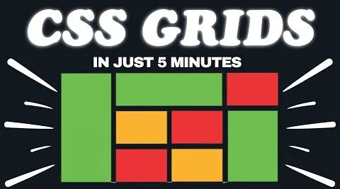
📺 Learn Visually – Watch the Full Video Tutorial
Before we dive deep into the blog content, we recommend watching this full video tutorial on YouTube for a clearer understanding of how CSS Grid works in action.
🎬 Watch & Learn: This visual walkthrough makes complex concepts easier to grasp. Feel free to pause, practice, and follow along.
💡 What is CSS Grid?
CSS Grid is a two-dimensional layout system in CSS, meaning it can handle both rows and columns at the same time. Unlike Flexbox, which works best in a single direction (either row or column), CSS Grid offers precise control over both axes.
It allows you to create complex layouts using simple, readable code—without relying on external frameworks or hacks like floating elements.
🚀 Why CSS Grid is a Must-Learn Skill
Here are a few compelling reasons to make CSS Grid part of your web development toolkit:
- ✅ Two-dimensional control – Layouts are easier to manage both vertically and horizontally.
- ✅ Cleaner code – Say goodbye to unnecessary
divwrappers and clearfix hacks. - ✅ Responsive-ready – Grid adapts easily to different screen sizes.
- ✅ Fully supported – All modern browsers (Chrome, Firefox, Safari, Edge) support it.
- ✅ Perfect for modular design – Great for dashboards, galleries, portfolios, and more.
“Grid is like the blueprint of your webpage. Mastering it means unlocking complete design freedom.” – Anonymous Frontend Developer
🧱 CSS Grid Basics: The Foundation
Let’s understand some key concepts that form the backbone of CSS Grid.
📦 Grid Container
A container becomes a grid when you set:
display: grid;
➕ Grid Tracks (Rows & Columns)
Define rows and columns using:
grid-template-columns: 1fr 1fr;
grid-template-rows: auto auto;
🔢 Fractional Units (fr)
The fr unit represents a fraction of available space. For example:
grid-template-columns: 2fr 1fr;
This creates two columns where the first is twice the width of the second.
⛓ Grid Lines and Spans
Grid items can be precisely placed using line numbers:
grid-column: 1 / 3;
grid-row: 2 / 4;
🎨 Common Layout Examples with CSS Grid
Let’s look at real-world use cases where CSS Grid shines:
1. Portfolio Gallery
Easily create responsive image grids that adjust column count on smaller screens.
2. Admin Dashboards
Grids help organize widgets, charts, and sidebars in a clean structure.
3. Hero Sections
Combine images, text, and buttons in layered yet controlled layouts.
4. Magazine Layouts
Build dynamic sections with overlapping content and fixed column widths.
“Design is not just what it looks like and feels like. Design is how it works.” — Steve Jobs
🛠 CSS Grid vs Flexbox: Know the Difference
| Feature | CSS Grid | Flexbox |
|---|---|---|
| Layout Direction | 2D (rows & columns) | 1D (row or column) |
| Best For | Page-level layouts | Component-level layouts |
| Item Placement | Grid lines, areas | Natural flow, alignment |
| Control Level | High (precise positioning) | Moderate (based on order/flow) |
| Use Case | Dashboards, full pages, galleries | Navbars, forms, buttons |
🧠 Pro Tip: Use Grid for page layout and Flexbox inside grid items.
🧰 Advanced Grid Features You Should Try
🔁 repeat() Function
Simplifies repetitive column or row values:
grid-template-columns: repeat(4, 1fr);
🔄 auto-fit and minmax()
Perfect for responsive layouts:
grid-template-columns: repeat(auto-fit, minmax(200px, 1fr));
🎯 Named Grid Areas
Create named sections like header, sidebar, and main:
grid-template-areas:
  "header header"
  "sidebar main";
📈 Real Projects Where Grid Excels
CSS Grid can be applied in various real-world applications. Let’s look at where it adds the most value:
- Portfolio Websites: Display projects side-by-side with adjustable columns.
- E-commerce Product Grids: Flexible grids that accommodate different screen widths.
- Landing Pages: Easily organize hero content, CTAs, and images.
- Photo Galleries: Maintain consistent aspect ratios with a neat layout.
- Blog Post Layouts: Arrange posts in card formats using rows and columns.
🌐 Learn More from These External Sources
For deeper dives, here are high-quality resources worth bookmarking:
These sources offer examples, playgrounds, and visual explanations of how Grid works under the hood.
🔥 Inspirational Quote for Designers
“CSS Grid is not just a tool—it’s your layout canvas. Use it to paint beautiful, functional web designs.”
📌 Practical Tips Before You Dive In
- ✅ Use browser dev tools to inspect grids visually.
- ✅ Always define fallback styles for older browsers if needed.
- ✅ Pair Grid with media queries for true responsiveness.
- ✅ Practice by rebuilding common website sections using only CSS Grid.
🏁 Conclusion: Embrace the Grid Revolution
CSS Grid isn’t just a nice-to-have—it’s a must-know for modern web designers and developers. Its flexibility, clarity, and two-dimensional control allow you to craft responsive, beautiful layouts without sacrificing performance or code cleanliness.
So what are you waiting for? Dive in, experiment, and bring your designs to life with the power of CSS grid.
🙋♀️ Frequently Asked Questions (FAQs)
Q1: Is CSS Grid hard to learn for beginners?
A: No! It may seem complex at first, but once you understand the core concepts, it becomes a powerful and intuitive tool.
Q2: Can I use CSS Grid with Flexbox?
A: Absolutely! They complement each other perfectly. Use Grid for overall layout and Flexbox inside individual components.
Q3: Is CSS Grid mobile-friendly?
A: Yes! Combine Grid with media queries and auto-fit or minmax() to create fully responsive layouts.
Q4: Which browsers support CSS Grid?
A: All major browsers including Chrome, Firefox, Safari, Edge, and Opera support CSS Grid.