Building a robust analytics Dashboard Design is a fundamental skill for any web developer. Imagine presenting complex data in a clear, intuitive, and visually appealing manner. You’re not just coding; you’re crafting a story with data! Indeed, a well-designed dashboard transforms raw numbers into actionable insights. This guide will walk you through creating a sleek, modern web analytics dashboard using the core triumvirate of web development: HTML for structure, CSS for style, and JavaScript for interactivity and data handling. Let’s build something awesome together!
What We Are Building: Crafting Your Analytics Dashboard Design
We’re embarking on a journey to build a beautiful, functional web analytics dashboard. Think of popular SaaS products like Google Analytics, Stripe, or even internal business intelligence tools. These platforms offer fantastic inspiration. They often feature clean layouts, intuitive navigation, and dynamic data visualizations. Our goal is to replicate that professional feel, ensuring users can quickly grasp critical information at a glance. Ultimately, the essence of good data presentation lies in clarity.
Analytics dashboards are more than just pretty faces; they’re vital tools in today’s data-driven world. Businesses rely on them to track KPIs, monitor user behavior, and make informed decisions. Furthermore, individual developers can use them to visualize personal project metrics or blog statistics. Creating a custom dashboard gives you full control over the user experience and the data points you prioritize. It’s a challenging yet incredibly rewarding project, offering immense value.
Trending designs often favor minimalist aesthetics, emphasizing readability and efficient use of space. Cards, distinct sections for different metrics, and interactive charts are common elements. These designs prioritize a positive user experience, making complex data accessible. We’ll implement many of these modern design principles in our dashboard.
HTML Structure: Laying the Foundation for Your Dashboard
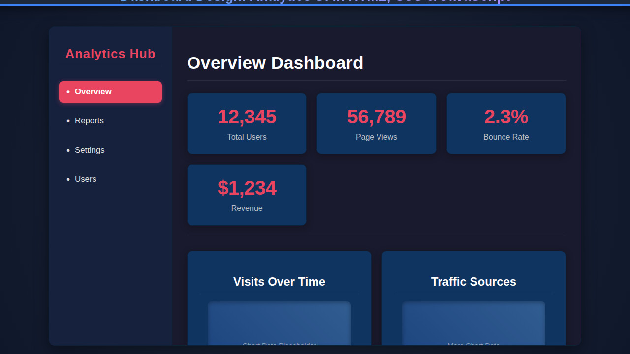
The HTML provides the semantic backbone of our dashboard. We’ll use logical elements to define distinct sections like the sidebar, header, main content area, and individual data cards. This ensures accessibility and makes our layout easier to style with CSS. Remember, good structure is key to a scalable design, resembling the careful planning seen in an ephemeral story design.
index.html
<!DOCTYPE html> <html lang="en"> <head> <meta charset="UTF-8"> <meta name="viewport" content="width=device-width, initial-scale=1.0"> <title>Web Analytics Dashboard</title> <link rel="stylesheet" href="styles.css"> </head> <body> <div class="dashboard-container"> <aside class="sidebar"> <h2>Analytics Hub</h2> <nav> <ul> <li><a href="#" class="active" data-section="overview">Overview</a></li> <li><a href="#" data-section="reports">Reports</a></li> <li><a href="#" data-section="settings">Settings</a></li> <li><a href="#" data-section="users">Users</a></li> </ul> </nav> </aside> <main class="main-content"> <h1>Dashboard Overview</h1> <section class="stats-grid"> <div class="stat-card"> <div class="value">12,345</div> <div class="label">Total Users</div> </div> <div class="stat-card"> <div class="value">56,789</div> <div class="label">Page Views</div> </div> <div class="stat-card"> <div class="value">2.3%</div> <div class="label">Bounce Rate</div> </div> <div class="stat-card"> <div class="value">$1,234</div> <div class="label">Revenue</div> </div> </section> <section class="chart-section"> <div class="chart-card"> <h3>Visits Over Time</h3> <div class="chart-placeholder">Chart Data Placeholder</div> </div> <div class="chart-card"> <h3>Traffic Sources</h3> <div class="chart-placeholder">More Chart Data</div> </div> </section> </main> </div> <script src="script.js" defer></script> </body> </html>script.js
// script.js document.addEventListener('DOMContentLoaded', () => { const navLinks = document.querySelectorAll('.sidebar nav ul li a'); const mainContentH1 = document.querySelector('.main-content h1'); const statCards = document.querySelectorAll('.stat-card'); // Function to update the main title (conceptual for a real dashboard) const updateMainTitle = (section) => { mainContentH1.textContent = `${section.charAt(0).toUpperCase() + section.slice(1)} Dashboard`; }; // Initialize the dashboard with the active section const initialActiveLink = document.querySelector('.sidebar nav ul li a.active'); if (initialActiveLink) { updateMainTitle(initialActiveLink.dataset.section); } // Add click event listeners to navigation links navLinks.forEach(link => { link.addEventListener('click', (e) => { e.preventDefault(); // Prevent default link behavior // Remove 'active' class from all links navLinks.forEach(nav => nav.classList.remove('active')); // Add 'active' class to the clicked link link.classList.add('active'); // Simulate content change (update title based on data-section attribute) const section = link.dataset.section; updateMainTitle(section); // In a real application, you would load dynamic content here // e.g., fetch('/api/dashboard/' + section) or update React/Vue components console.log(`Navigated to: ${section}`); }); }); // Optional: Add some dynamic numbers to stat cards on load // (This is a placeholder for actual data fetching/chart rendering) const statData = { 'Total Users': '12,345', 'Page Views': '56,789', 'Bounce Rate': '2.3%', 'Revenue': '$1,234' }; statCards.forEach(card => { const labelElement = card.querySelector('.label'); if (labelElement) { const labelText = labelElement.textContent.trim(); if (statData[labelText]) { const valueElement = card.querySelector('.value'); if (valueElement) { // In a real scenario, you might animate this or load actual data valueElement.textContent = statData[labelText]; } } } }); console.log("Dashboard loaded and scripts initialized."); }); // A simple function to simulate fetching data for charts function fetchChartData(chartName) { console.log(`Fetching data for ${chartName}...`); return new Promise(resolve => { setTimeout(() => { // Simulate data for a simple chart const data = { labels: ['Jan', 'Feb', 'Mar', 'Apr', 'May', 'Jun'], values: [Math.floor(Math.random() * 100) + 50, Math.floor(Math.random() * 100) + 50, Math.floor(Math.random() * 100) + 50, Math.floor(Math.random() * 100) + 50, Math.floor(Math.random() * 100) + 50, Math.floor(Math.random() * 100) + 50] }; resolve(data); }, 1000); // Simulate network delay }); } // Example of how you might use it (not directly integrated into current UI) // fetchChartData('Visits Over Time').then(data => { // console.log('Visits data:', data); // // Here you would render a chart using a library like Chart.js or D3.js // });CSS Styling: Bringing the Dashboard to Life
With our HTML in place, CSS steps in to transform raw elements into a visually stunning dashboard. We’ll apply modern styling techniques including Flexbox and CSS Grid for layout, create elegant cards, define a cohesive color scheme, and ensure responsive behavior. This is where the dashboard truly begins to take shape, becoming both functional and appealing.
styles.css
@charset "UTF-8"; /* Global Resets & Box Model */ *, *::before, *::after { box-sizing: border-box; margin: 0; padding: 0; } :root { --bg-color: #1a1a2e; --sidebar-bg: #16213e; --card-bg: #0f3460; --text-color: #e0e0e0; --accent-color: #e94560; --border-color: #0d2138; --hover-color: #2b4865; --shadow-dark: rgba(0, 0, 0, 0.4); } body { font-family: Arial, Helvetica, sans-serif; background-color: var(--bg-color); color: var(--text-color); display: flex; justify-content: center; align-items: center; min-height: 100vh; width: 100vw; overflow: hidden; /* Ensure no body scrollbars */ line-height: 1.6; -webkit-font-smoothing: antialiased; -moz-osx-font-smoothing: grayscale; } /* Dashboard Container */ .dashboard-container { display: flex; width: 90%; max-width: 1200px; height: 90vh; max-height: 680px; /* Designed to fit 1280x720 comfortably */ background-color: var(--sidebar-bg); border-radius: 12px; overflow: hidden; box-shadow: 0 10px 30px var(--shadow-dark); border: 1px solid var(--border-color); } /* Sidebar */ .sidebar { width: 250px; background-color: var(--sidebar-bg); padding: 20px; border-right: 1px solid var(--border-color); display: flex; flex-direction: column; flex-shrink: 0; } .sidebar h2 { color: var(--accent-color); text-align: center; margin-bottom: 30px; font-size: 1.6em; letter-spacing: 1px; padding-bottom: 10px; border-bottom: 1px solid rgba(255, 255, 255, 0.05); } .sidebar nav ul { list-style: none; padding: 0; margin: 0; flex-grow: 1; /* Allow navigation list to grow */ } .sidebar nav ul li { margin-bottom: 15px; } .sidebar nav ul li:last-child { margin-bottom: 0; } .sidebar nav ul li a { display: block; padding: 12px 15px; color: var(--text-color); text-decoration: none; border-radius: 8px; transition: background-color 0.3s ease, color 0.3s ease, transform 0.2s ease; display: flex; align-items: center; font-size: 1.05em; } .sidebar nav ul li a:hover { background-color: var(--hover-color); transform: translateX(5px); } .sidebar nav ul li a.active { background-color: var(--accent-color); color: white; font-weight: bold; box-shadow: 0 2px 10px rgba(233, 69, 96, 0.4); } .sidebar nav ul li a::before { content: "•"; margin-right: 10px; font-size: 1.2em; line-height: 1; color: currentColor; /* Inherit color */ } /* Main Content Area */ .main-content { flex-grow: 1; padding: 30px; background-color: var(--bg-color); display: flex; flex-direction: column; overflow-y: auto; /* Allow content to scroll if it overflows */ max-width: calc(100% - 250px); /* Account for sidebar width */ } .main-content h1 { color: white; margin-bottom: 25px; font-size: 2.2em; letter-spacing: 0.5px; border-bottom: 1px solid rgba(255, 255, 255, 0.08); padding-bottom: 15px; } /* Stats Grid */ .stats-grid { display: grid; grid-template-columns: repeat(auto-fit, minmax(220px, 1fr)); gap: 20px; margin-bottom: 30px; padding-bottom: 20px; border-bottom: 1px solid rgba(255, 255, 255, 0.05); } .stat-card { background-color: var(--card-bg); padding: 25px; border-radius: 10px; box-shadow: 0 4px 15px rgba(0, 0, 0, 0.3); border: 1px solid var(--border-color); text-align: center; transition: transform 0.2s ease, box-shadow 0.2s ease; } .stat-card:hover { transform: translateY(-5px); box-shadow: 0 8px 25px rgba(0, 0, 0, 0.5); } .stat-card .value { font-size: 2.5em; font-weight: bold; color: var(--accent-color); margin-bottom: 10px; letter-spacing: -0.5px; } .stat-card .label { font-size: 1em; color: var(--text-color); opacity: 0.8; } /* Chart Section */ .chart-section { display: grid; grid-template-columns: repeat(auto-fit, minmax(300px, 1fr)); /* Allow two columns on wider screens */ gap: 20px; flex-grow: 1; } .chart-card { background-color: var(--card-bg); padding: 25px; border-radius: 10px; box-shadow: 0 4px 15px rgba(0, 0, 0, 0.3); border: 1px solid var(--border-color); min-height: 280px; /* Slightly taller for visual balance */ display: flex; flex-direction: column; justify-content: center; align-items: center; position: relative; } .chart-card h3 { margin-top: 0; color: white; font-size: 1.5em; margin-bottom: 15px; border-bottom: 1px solid rgba(255, 255, 255, 0.05); padding-bottom: 10px; width: 100%; text-align: center; } .chart-placeholder { width: 90%; height: 180px; /* Taller placeholder */ background: linear-gradient(45deg, #1f4788, #406fa7); border-radius: 8px; display: flex; justify-content: center; align-items: center; font-size: 0.9em; opacity: 0.7; color: rgba(255,255,255,0.7); box-shadow: inset 0 2px 8px rgba(0,0,0,0.4); /* Inner shadow for depth */ } /* Responsive adjustments for smaller screens */ @media (max-width: 992px) { /* Adjust breakpoint for chart-section */ .chart-section { grid-template-columns: 1fr; } } @media (max-width: 768px) { .dashboard-container { flex-direction: column; width: 95%; height: auto; min-height: 90vh; /* Ensure it still takes vertical space */ max-height: none; /* Remove max height for vertical stacking */ } .sidebar { width: 100%; border-right: none; border-bottom: 1px solid var(--border-color); padding-bottom: 10px; } .sidebar h2 { margin-bottom: 15px; } .sidebar nav ul { display: flex; flex-wrap: wrap; justify-content: center; } .sidebar nav ul li { margin: 0 10px 10px 0; } .sidebar nav ul li:last-child { margin-right: 0; } .main-content { padding: 20px; max-width: 100%; /* No sidebar width to subtract */ } .stats-grid { grid-template-columns: 1fr; } } @media (max-width: 480px) { .stat-card .value { font-size: 2em; } .main-content h1 { font-size: 1.8em; } .chart-card h3 { font-size: 1.3em; } }Step-by-Step Breakdown: Understanding the Code
The Core Layout and Navigation (HTML & CSS)
Our dashboard starts with a main container,
.dashboard-wrapper, using Flexbox to arrange the sidebar and main content. The<aside class="sidebar">holds our navigation, complete with a branding header (.sidebar-header) and a list of links (.sidebar-nav). Each navigation item includes an icon from Font Awesome, enhancing visual cues for users. The CSS for the sidebar establishes a dark background, white text, and hover effects for a smooth user experience. It’s positioned to be a prominent yet unobtrusive navigation hub. This clear separation of concerns is vital. We want the layout to be intuitive, enabling users to move between sections effortlessly.Crafting Data Cards and Metric Display (HTML & CSS)
The
<section class="metrics-grid">is a vital part of our dashboard, designed to showcase key performance indicators. It leverages CSS Grid to arrange multiple.card.metric-cardelements in an organized, responsive manner. Each metric card typically features an icon (.card-icon), a descriptive title, the current metric value, and a change indicator (.metric-change) to show trends. We use classes likepositiveornegativeto dynamically color these changes with green or red, respectively. The CSS defines universal card styles with padding, rounded corners, and subtle box shadows for depth. Importantly, these cards are designed to be easily digestible, offering quick insights. Visual hierarchy here is crucial.Integrating Charts and Dynamic Content (HTML & CSS Concept)
Within the
<main class="main-content">, we have a dedicated<section class="chart-section card">. While the HTML snippet only includes a placeholder<div id="chart-container">, this is where JavaScript would dynamically render actual data visualizations. You might integrate libraries like Chart.js or D3.js here to display line graphs, bar charts, or pie charts. The CSS ensures this section maintains the consistent card styling, providing a clean canvas for your graphs. Similarly, the.recent-activitysection is a simple list that would also be populated by JavaScript, fetching and displaying the latest user interactions or system events. Considering a flexible structure for data retrieval can be vital; you might even explore design patterns like the Singleton Pattern for managing your API calls or data stores efficiently.“A well-designed dashboard is like a great story: it captures attention, informs, and guides to action without overwhelming the audience.”
Global Styles, Typography, and Header Actions (CSS)
Our CSS starts with a basic reset and sets a default font (e.g., ‘Inter’, sans-serif) and a soft background color for the
<body>. The.main-headerincludes a prominent title and a section for.header-actions, which contains an input for date selection and an export button. Styling for these elements is straightforward: padding, borders, and hover effects for buttons ensure a polished look. We use a consistent color palette, where#2c3e50serves as a dark primary color, and#3498dbacts as an accent. This unified styling creates a professional and coherent visual identity for the entire dashboard.Enhancing User Interaction: Links and Button Styles (CSS)
Throughout the dashboard, we use styled links and buttons to guide user interaction. In the sidebar, navigation links are designed to be clear and inviting, with a subtle background change on hover or when active. The `btn` and `btn-primary` classes define common button styles, ensuring consistent appearance across all interactive elements. These styles are easily reusable, which helps maintain a uniform design language. Pay close attention to accessibility here; ensure sufficient contrast and provide visual feedback for interactive elements. This attention to detail significantly improves the overall user experience.
Making It Responsive: Adapting Your Dashboard Design
In today’s multi-device world, a responsive dashboard isn’t optional; it’s essential. Our CSS includes media queries to adapt the layout for smaller screens. For instance, on tablets (
max-width: 992px), the sidebar might become slightly narrower, and font sizes adjust. However, for mobile devices (max-width: 768px), a more significant transformation occurs. The.dashboard-wrapperswitches from a Flexbox row to a column, stacking the sidebar above the main content. The sidebar itself becomes a horizontal bar, often hiding navigation links behind a hamburger menu (which would require JavaScript). Similarly, the.metrics-gridmight switch to a single column layout, ensuring cards are stacked vertically for readability. Exploring techniques like those outlined on CSS-Tricks for responsive layouts can be incredibly helpful here. This mobile-first approach ensures a great experience regardless of device.The Art of Dashboard Design: Bringing It All Together
By combining well-structured HTML and carefully crafted CSS, we’ve achieved a visually appealing and highly functional analytics dashboard. The clear separation of concerns, semantic HTML, and intuitive CSS styling contribute to a user interface that’s easy to navigate and understand. Key visual elements include the consistent card design, the organized metric grid, and the adaptable layout that gracefully handles various screen sizes. Moreover, the thoughtful use of color and typography ensures data readability and a pleasant aesthetic. The dashboard offers an instant overview of critical metrics, making it a powerful tool for data analysis and decision-making.
“Effective web development is not just about writing code; it’s about crafting experiences. A dashboard is a prime example of turning data into a delightful interaction.”
Conclusion: Your Dashboard Design Journey Continues
You’ve seen how to construct a modern web analytics dashboard using HTML, CSS, and conceptual JavaScript. From setting up the core structure to applying responsive styles, every step contributes to a professional and highly usable interface. This foundation is incredibly versatile. You can apply these principles to create dashboards for various applications, including e-commerce analytics, personal finance trackers, IoT device monitoring, or even project management tools. The possibilities are truly endless!
Continue experimenting with different data visualization libraries, explore advanced CSS techniques, and deepen your understanding of UI/UX principles. Your journey into dashboard development has just begun. Keep building, keep learning, and keep turning data into compelling visual stories. Happy coding!