A Color Contrast Tool is an indispensable asset for every web developer and designer. In a world striving for digital inclusivity, ensuring your content is readable by everyone isn’t just a best practice; it’s a fundamental requirement. We’re talking about adhering to Web Content Accessibility Guidelines (WCAG), which are crucial for creating experiences that truly serve all users. This guide will walk you through building your very own accessible color contrast checker from scratch, using the web’s foundational trio: HTML, CSS, and JavaScript. Get ready to enhance your toolkit!
What We Are Building
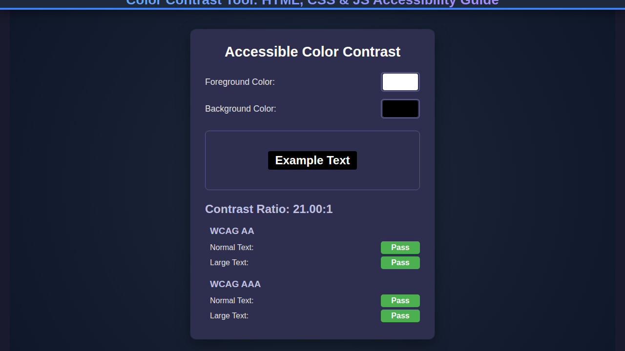
Imagine a sleek, intuitive application where you can pick any foreground and background color, instantly seeing their contrast ratio. Our tool will do exactly that, but with an important twist: it will also tell you if those colors meet WCAG AA and AAA compliance levels for both normal and large text. This isn’t just about aesthetics; it’s about making sure your text doesn’t vanish into the background for users with visual impairments or in challenging viewing conditions.
This type of tool is trending because accessibility is no longer an afterthought. Modern web development places a strong emphasis on inclusive design, and rightly so. Search engines reward accessible sites, and more importantly, it’s the right thing to do. By integrating a color contrast checker into your workflow, you can proactively design interfaces that are readable, user-friendly, and compliant. It’s an easy win for both your users and your project’s reach.
You can use this tool throughout your entire development lifecycle. Design teams can validate color palettes before a single line of code is written. Developers can double-check existing designs or test new components on the fly. Project managers can even use it for quick audits. Ultimately, our goal is to empower you to build web experiences that are not only beautiful but also universally accessible.
HTML Structure
Our HTML provides the semantic backbone for our color contrast tool. We’ll use a straightforward structure, organizing our input fields for foreground and background colors, a display area for sample text, and dedicated sections for presenting the contrast ratio and WCAG compliance results. Every element plays a specific role, guiding the user through the process.
<div class="color-contrast-tool">
    <div class="color-picker-group">
        <div class="color-input">
            <label for="fgColor">Foreground Color</label>
            <input type="color" id="fgColor" value="#ffffff">
            <input type="text" id="fgHex" value="#FFFFFF">
        </div>
        <div class="swap-button">
            <button id="swapColors" aria-label="Swap foreground and background colors">⇅</button>
        </div>
        <div class="color-input">
            <label for="bgColor">Background Color</label>
            <input type="color" id="bgColor" value="#000000">
            <input type="text" id="bgHex" value="#000000">
        </div>
    </div>

    <div class="contrast-display">
        <p id="sampleText">The quick brown fox jumps over the lazy dog.</p>
    </div>

    <div class="results">
        <div class="contrast-ratio">
            Contrast Ratio: <span id="ratioValue">21:1</span>
        </div>
        <div class="compliance-row">
            <h3>WCAG AA</h3>
            <span id="aaNormal" class="compliance-status">PASS</span> (Normal Text)
            <span id="aaLarge" class="compliance-status">PASS</span> (Large Text)
        </div>
        <div class="compliance-row">
            <h3>WCAG AAA</h3>
            <span id="aaaNormal" class="compliance-status">PASS</span> (Normal Text)
            <span id="aaaLarge" class="compliance-status">PASS</span> (Large Text)
        </div>
    </div>
</div>
CSS Styling
With our HTML in place, we will now add the CSS. This styling transforms raw elements into a visually appealing and functional user interface. We’ll implement a clean, modern design, ensuring the tool is intuitive to use and easy on the eyes. From layout to specific component styles, every rule serves to enhance the user experience.
.color-contrast-tool {
    font-family: 'Segoe UI', Tahoma, Geneva, Verdana, sans-serif;
    max-width: 800px;
    margin: 2em auto;
    padding: 1.5em;
    background-color: #f8f8f8;
    border-radius: 8px;
    box-shadow: 0 4px 15px rgba(0, 0, 0, 0.1);
    display: flex;
    flex-direction: column;
    gap: 1.5em;
}

.color-picker-group {
    display: flex;
    justify-content: center;
    align-items: flex-end;
    gap: 1em;
    flex-wrap: wrap;
}

.color-input {
    display: flex;
    flex-direction: column;
    gap: 0.5em;
    min-width: 150px;
}

.color-input label {
    font-weight: bold;
    color: #333;
}

.color-input input[type="color"] {
    width: 100%;
    height: 50px;
    border: none;
    padding: 0;
    cursor: pointer;
    border-radius: 4px;
    -webkit-appearance: none;
    appearance: none;
    background-color: transparent;
}

.color-input input[type="color"]::-webkit-color-swatch-wrapper { padding: 0; }
.color-input input[type="color"]::-webkit-color-swatch { border: none; border-radius: 4px; }
.color-input input[type="color"]::-moz-color-swatch { border: none; border-radius: 4px; }

.color-input input[type="text"] {
    padding: 0.6em;
    border: 1px solid #ddd;
    border-radius: 4px;
    font-size: 1em;
    text-transform: uppercase;
}

.swap-button {
    display: flex;
    align-items: center;
    justify-content: center;
    height: 50px;
}

.swap-button button {
    background-color: #007bff;
    color: white;
    border: none;
    border-radius: 50%;
    width: 40px;
    height: 40px;
    font-size: 1.2em;
    cursor: pointer;
    transition: background-color 0.3s ease;
    display: flex;
    align-items: center;
    justify-content: center;
}

.swap-button button:hover {
    background-color: #0056b3;
}

.contrast-display {
    border: 1px solid #e0e0e0;
    padding: 2em;
    border-radius: 8px;
    min-height: 150px;
    display: flex;
    align-items: center;
    justify-content: center;
    text-align: center;
    transition: background-color 0.3s ease, color 0.3s ease;
}

#sampleText {
    font-size: 1.5em;
    font-weight: bold;
    margin: 0;
    word-wrap: break-word;
    padding: 0.5em;
}

.results {
    background-color: #ffffff;
    border: 1px solid #e9e9e9;
    padding: 1.5em;
    border-radius: 8px;
    display: grid;
    grid-template-columns: 1fr;
    gap: 1em;
}

.contrast-ratio {
    font-size: 1.8em;
    font-weight: bold;
    text-align: center;
    margin-bottom: 0.5em;
    color: #333;
}

.compliance-row {
    display: flex;
    align-items: center;
    gap: 0.8em;
    font-size: 1.1em;
    flex-wrap: wrap;
}

.compliance-row h3 {
    margin: 0;
    font-size: 1.1em;
    color: #555;
    flex-basis: 80px;
}

.compliance-status {
    padding: 0.3em 0.7em;
    border-radius: 4px;
    font-weight: bold;
    display: inline-block;
    min-width: 60px;
    text-align: center;
}

.compliance-status.pass {
    background-color: #d4edda;
    color: #155724;
    border: 1px solid #c3e6cb;
}

.compliance-status.fail {
    background-color: #f8d7da;
    color: #721c24;
    border: 1px solid #f5c6cb;
}

@media (min-width: 600px) {
    .results {
        grid-template-columns: repeat(2, 1fr);
    }
    .compliance-row {
        justify-content: flex-start;
    }
}

@media (max-width: 599px) {
    .color-picker-group {
        flex-direction: column;
        align-items: center;
    }
    .color-input {
        width: 100%;
        max-width: 250px;
    }
    .swap-button {
        margin: 1em 0;
        order: 2;
    }
    .color-input:first-child { order: 1; }
    .color-input:last-child { order: 3; }
}
Step-by-Step Breakdown
Now for the real magic: JavaScript. This is where we bring our static HTML and styled CSS to life, making the color contrast tool interactive and dynamic. We’ll handle user input, perform complex calculations, and update the UI in real-time. Let’s dive into the core logic.
Grabbing Elements and Initial Setup
First, we need to get references to all our HTML elements. Using document.getElementById(), we can access the foreground and background color inputs, the hex text fields, the sample text, the contrast display area, and all the compliance status spans. We’ll also set some default colors initially, ensuring the tool starts in a valid state. This setup is crucial for smooth interaction.
After we have these references, we can attach event listeners. These listeners will detect changes in the color pickers or hex input fields. Whenever a user interacts with these elements, our JavaScript will spring into action, recalculating and updating the display. This real-time feedback is essential for a great user experience.
The Core Contrast Calculation
At the heart of our tool lies the contrast ratio calculation. This involves converting hex color codes to RGB, then computing the relative luminance for both foreground and background colors. Relative luminance, a measure of the perceived brightness of a color, is a critical step. The formula for relative luminance is quite specific, accounting for how human vision perceives light. You can learn more about its intricacies on MDN Web Docs’ accessibility section.
Once we have the luminance values, we apply the WCAG contrast ratio formula: (L1 + 0.05) / (L2 + 0.05), where L1 is the brighter color’s luminance and L2 is the darker. This calculation gives us a precise ratio, which directly informs our WCAG compliance checks. Remember, even subtle color changes can significantly impact this ratio.
Handling User Input and Displaying Results
Event listeners on our input type="color" and input type="text" fields are essential. When a user selects a new color or types in a hex value, we capture that input. We then update the corresponding input field (e.g., updating the hex text when the color picker changes). This synchronization keeps the UI consistent.
After calculating the new contrast ratio, we update the #ratioValue span. More importantly, we dynamically change the #sampleText‘s color and the .contrast-display‘s background color. This immediate visual feedback makes the tool incredibly intuitive. For a deeper dive into interactive design, especially with forms and real-time updates, you might find this resource on interactive design with HTML, CSS & JS quite helpful.
WCAG Compliance Checks
Finally, we assess compliance against WCAG AA and AAA standards. These standards have different requirements for normal text and large text (defined as 18pt or 14pt bold and larger). For instance, normal text needs a 4.5:1 ratio for AA, while large text only requires 3:1. AAA is stricter, requiring 7:1 for normal text and 4.5:1 for large text. Based on our calculated ratio, we update the compliance-status spans with ‘PASS’ or ‘FAIL’ and apply corresponding styles (e.g., green for pass, red for fail).
Accessibility isn’t a feature; it’s a fundamental right. Tools like this empower us to build a more inclusive web for everyone.
Making Your Color Contrast Tool Shine on Every Screen
In today’s multi-device world, a responsive design is non-negotiable. Our color contrast tool must look great and function flawlessly on everything from a large desktop monitor to a tiny smartphone screen. We achieve this through careful use of CSS media queries and flexible layout techniques.
A mobile-first approach is highly recommended. We start by designing for the smallest screens, ensuring core functionality and readability are perfect. Then, we progressively enhance the layout for larger viewports. For instance, on small screens, our color pickers might stack vertically, while on larger screens, they align horizontally. Flexbox and CSS Grid are your best friends here. They allow for incredible flexibility with minimal code.
Media queries, like those already included in our CSS, enable us to apply specific styles based on screen width. We adjust font sizes, padding, and especially the layout of our .color-picker-group and .results sections. This ensures elements adapt gracefully, maintaining usability and aesthetic appeal across all devices. For more expert tips on crafting responsive layouts, check out CSS-Tricks’ comprehensive Flexbox guide.
Final Output
Once you’ve implemented all the HTML, CSS, and JavaScript, you’ll have a fully functional, elegant, and highly accessible color contrast tool. Users will experience smooth color updates, instant feedback on WCAG compliance, and an intuitive interface that makes checking contrast ratios a breeze.
Key visual elements achieved include: a clean card-like layout, easily distinguishable color input fields, a dynamic sample text area that immediately reflects color changes, and clear, color-coded ‘PASS’ or ‘FAIL’ indicators for each WCAG standard. This comprehensive feedback loop makes it easy for anyone to understand and apply accessibility best practices. Moreover, the tool’s responsiveness guarantees a consistent experience, regardless of the device used. Building tools with real-time feedback can be incredibly powerful; explore similar concepts with SSE JavaScript for real-time data.
Mastering Accessibility with Your New Color Contrast Tool
Congratulations! You’ve successfully built a powerful and practical color contrast tool. This project not only sharpens your HTML, CSS, and JavaScript skills but also instills a deeper understanding of web accessibility. Remember, accessible design benefits everyone, creating a more inclusive digital landscape.
You can apply the knowledge gained here to countless scenarios. Integrate this tool into your design system, use it for client projects, or even share it with your team as a standard accessibility check. It’s a fantastic way to ensure your interfaces meet necessary guidelines, making them robust and user-friendly for all.
The beauty of web development lies in creating experiences that leave no one behind. Your new tool is a step towards that universal goal.
Keep experimenting with colors and contrast. Challenge yourself to find color palettes that not only look good but also achieve AAA compliance. This hands-on experience will make you a more mindful and skilled developer, contributing to a better web for all. If you’re looking for more ways to streamline your development and testing workflows, especially when dealing with data, consider exploring API Mocking in JavaScript.