Imagine a space where you can write HTML, CSS, and JavaScript, then see your creations come to life instantly. This is the magic of an interactive Code Playground, a vital tool for learning, prototyping, and sharing front-end experiments. We will embark on an exciting journey today, building our very own code playground from the ground up, using the fundamental trio of web development: HTML, CSS, and vanilla JavaScript. Get ready to dive deep into making web development truly interactive and accessible!
What We Are Building
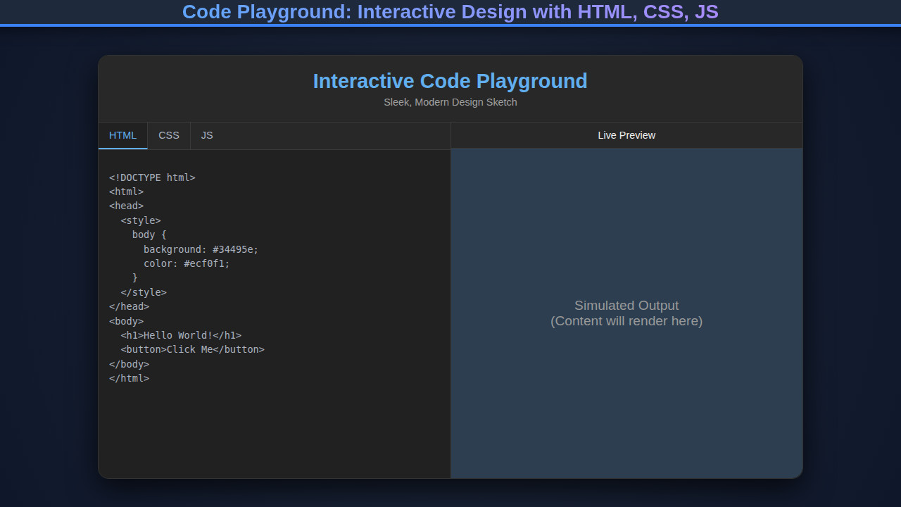
We are going to construct a powerful, user-friendly interactive coding environment directly in the browser. Think of platforms like CodePen or JSFiddle, but simplified and tailor-made by us! Our playground will feature three distinct editor panels for HTML, CSS, and JavaScript code, along with a live preview area. This setup allows users to write their code in real-time and immediately observe the rendered output.
The demand for interactive coding environments is skyrocketing, particularly for educational purposes and quick prototyping. Developers appreciate the instant feedback, which significantly speeds up the learning curve and debugging process. It’s an excellent way to test small snippets, share visual concepts, or even demonstrate intricate Design System Components: HTML, CSS & JS Development without needing a full development environment.
Moreover, these playgrounds are becoming indispensable in developer portfolios, technical interviews, and online tutorials. They provide a frictionless way to showcase skills and explain concepts visually. Our version will serve as a robust foundation, which you can later expand with features like syntax highlighting, code linting, or even pre-processors.
HTML Structure for Our Code Playground
Our HTML serves as the skeleton, defining the layout and distinct areas for our editors and output. We’ll use semantic tags and create clear divisions to house our HTML, CSS, and JavaScript input fields, alongside the iframe for the live preview. It’s a straightforward setup designed for maximum clarity and ease of manipulation with CSS and JavaScript.
index.html
<!DOCTYPE html>
<html lang="en">
<head>
    <meta charset="UTF-8">
    <meta name="viewport" content="width=device-width, initial-scale=1.0">
    <title>Interactive Code Playground</title>
    <link rel="stylesheet" href="styles.css">
</head>
<body>
    <div class="playground-container">
        <div class="editor-panel">
            <div class="editor-group">
                <label for="html-editor">HTML</label>
                <textarea id="html-editor" spellcheck="false"><h1>Hello World!</h1>
<button>Click Me</button></textarea>
            </div>
            <div class="editor-group">
                <label for="css-editor">CSS</label>
                <textarea id="css-editor" spellcheck="false">body {
  font-family: Arial, Helvetica, sans-serif;
  display: flex;
  justify-content: center;
  align-items: center;
  min-height: 100vh;
  margin: 0;
  background-color: #2c3e50; /* Darker background for preview */
  color: #ecf0f1;
}

h1 {
  color: #3498db;
}

button {
  background-color: #27ae60;
  color: white;
  border: none;
  padding: 10px 20px;
  border-radius: 5px;
  cursor: pointer;
  font-size: 1em;
  transition: background-color 0.3s ease;
}

button:hover {
  background-color: #2ecc71;
}</textarea>
            </div>
            <div class="editor-group">
                <label for="js-editor">JavaScript</label>
                <textarea id="js-editor" spellcheck="false">const button = document.querySelector('button');
button.addEventListener('click', () => {
  alert('Button clicked!');
});</textarea>
            </div>
        </div>
        <div class="preview-panel">
            <iframe id="preview-pane" title="Live Preview"></iframe>
        </div>
    </div>

    <script src="script.js"></script>
</body>
</html>
script.js
const htmlEditor = document.getElementById('html-editor');
const cssEditor = document.getElementById('css-editor');
const jsEditor = document.getElementById('js-editor');
const previewPane = document.getElementById('preview-pane');

function updatePreview() {
    const htmlCode = htmlEditor.value;
    const cssCode = cssEditor.value;
    const jsCode = jsEditor.value;

    const documentContent = `
        <!DOCTYPE html>
        <html>
        <head>
            <style>
                ${cssCode}
            </style>
        </head>
        <body>
            ${htmlCode}
            <script>
                // Prevent script errors from breaking the main page
                try {
                    ${jsCode}
                } catch (error) {
                    console.error('Error in user JavaScript:', error);
                }
            </script>
        </body>
        </html>
    `;

    // Write content to the iframe
    // Using srcdoc is an alternative but might have size limitations
    // Direct contentDocument manipulation is generally more flexible for this use case.
    if (previewPane.contentDocument) {
        previewPane.contentDocument.open();
        previewPane.contentDocument.write(documentContent);
        previewPane.contentDocument.close();
    } else {
        // Fallback for older browsers or if contentDocument is not ready
        console.error("Preview iframe contentDocument not accessible.");
    }
}

// Add event listeners for instant updates
htmlEditor.addEventListener('input', updatePreview);
cssEditor.addEventListener('input', updatePreview);
jsEditor.addEventListener('input', updatePreview);

// Initial update to display default code
updatePreview();
CSS Styling
With the HTML in place, CSS brings our playground to life, giving it an intuitive and modern aesthetic. We’ll focus on a split-panel design, ensuring the code editors are distinct yet harmoniously integrated. Expect careful use of flexbox or grid for layout, along with appealing typography, color schemes, and subtle visual cues to enhance user experience.
styles.css
/* Universal box-sizing for consistent layout */
*, *::before, *::after {
    box-sizing: border-box;
}

/* Basic body styles */
body {
    margin: 0;
    font-family: Arial, Helvetica, sans-serif;
    background-color: #1a1a1a; /* Very dark background */
    color: #e0e0e0; /* Light text for contrast */
    display: flex;
    justify-content: center;
    align-items: center;
    min-height: 100vh;
    overflow: hidden; /* Prevent body scroll if content overflows */
}

.playground-container {
    display: flex;
    width: 90%; /* Responsive width */
    max-width: 1200px; /* Max width for large screens */
    height: 70vh; /* Fixed height for the playground */
    background-color: #2a2a2a; /* Slightly lighter than body for container */
    border-radius: 12px;
    box-shadow: 0 8px 30px rgba(0, 0, 0, 0.5); /* Deep shadow for cinematic effect */
    overflow: hidden; /* Ensure content inside doesn't spill */
}

.editor-panel {
    flex: 1; /* Takes half width */
    display: flex;
    flex-direction: column;
    gap: 10px;
    padding: 20px;
    background-color: #1f1f1f; /* Darker background for editors */
    border-right: 1px solid #333; /* Separator */
    overflow-y: auto; /* Allow scrolling for editors if content is long */
}

.editor-group {
    flex: 1; /* Each editor group takes equal space */
    display: flex;
    flex-direction: column;
}

.editor-group label {
    font-size: 0.9em;
    color: #bbb;
    margin-bottom: 5px;
    text-transform: uppercase;
    letter-spacing: 0.5px;
}

textarea {
    flex: 1; /* Take remaining space in the editor-group */
    width: 100%;
    min-height: 80px; /* Minimum height for textareas */
    background-color: #282c34; /* Editor specific background */
    border: 1px solid #3d424b;
    border-radius: 6px;
    padding: 10px;
    font-family: 'Consolas', 'Monaco', 'Andale Mono', 'Ubuntu Mono', monospace; /* Monospace font for code */
    font-size: 0.95em;
    color: #abb2bf; /* Code text color */
    resize: vertical; /* Allow vertical resizing, but not horizontal */
    outline: none; /* Remove default outline */
    transition: border-color 0.2s ease;
}

textarea:focus {
    border-color: #61afef; /* Highlight focus */
}

.preview-panel {
    flex: 1; /* Takes half width */
    padding: 20px;
    background-color: #2c3e50; /* Distinct background for preview */
    display: flex;
    flex-direction: column;
    align-items: center;
    justify-content: center; /* Center iframe */
}

#preview-pane {
    width: 100%;
    height: 100%;
    border: 1px solid #4a4a4a; /* Border for the iframe */
    border-radius: 8px;
    background-color: #ffffff; /* Default background for iframe content */
    overflow: hidden; /* Ensure iframe content doesn't create scrollbars outside */
}

/* Responsive adjustments */
@media (max-width: 768px) {
    .playground-container {
        flex-direction: column; /* Stack editors and preview vertically */
        height: auto; /* Auto height for mobile */
        width: 95%;
    }

    .editor-panel {
        border-right: none;
        border-bottom: 1px solid #333; /* Separator for stacked panels */
    }

    .editor-group {
        flex: none; /* Don't flex for equal space in stacked layout */
    }

    textarea {
        min-height: 120px; /* Taller textareas for mobile */
    }

    .preview-panel {
        min-height: 300px; /* Minimum height for preview on mobile */
    }
}
Step-by-Step Breakdown: Unlocking the Code Playground’s Potential
This is where the magic happens, as JavaScript stitches everything together, making our playground truly interactive. We’ll connect the input fields to the live preview, ensuring every keystroke updates the output in real-time. We will manage this through a series of event listeners and DOM manipulations, crafting a dynamic experience for users.
Setting Up the Editor and Output Areas
First, we need to grab references to our key HTML elements: the HTML, CSS, and JavaScript text areas, and the iframe that will display our live output. Using document.getElementById() or document.querySelector() proves quite effective for this. Each textarea will function as a separate code editor, while the iframe acts as our mini-browser, sandboxed for safety.
Consider giving each textarea a default value for HTML, CSS, and JavaScript. This provides a clear starting point for new users and immediately demonstrates functionality. For example, you might pre-fill the HTML with a basic <h1>Hello World!</h1>. Furthermore, ensure your iframe has an appropriate ID for easy access. We are trying to make a seamless experience.
“The best way to learn is to do. An interactive code playground brings this principle to life, providing immediate feedback on your coding experiments.”
Real-Time Code Execution
The core functionality of our Code Playground lies in its ability to execute code in real-time. We achieve this by attaching ‘input’ event listeners to each of our text areas. Whenever a user types, pastes, or changes the content within an editor, this event fires, triggering our update function. This approach ensures a truly live preview, eliminating the need for a separate “run” button.
Inside our update function, we collect the current content from all three text areas. We then dynamically construct a complete HTML document string. This string will include the user’s HTML, embed their CSS within <style> tags, and inject their JavaScript within <script> tags. It’s crucial to understand how browsers process this – HTML provides structure, CSS styles it, and JavaScript adds interactivity.
To safely inject this combined code into our iframe, we access its contentDocument property. We then write the entire constructed HTML string directly into the iframe’s document using iframe.contentDocument.open(), iframe.contentDocument.write(htmlContent), and iframe.contentDocument.close(). This process effectively rewrites the iframe’s content with our latest code, offering that instant visual feedback.
For a deeper dive into how browsers handle document manipulation and security considerations within iframes, you might find MDN Web Docs on iframes to be an invaluable resource. This helps prevent Prompt Injection Prevention with JavaScript issues by encapsulating the execution.
Synchronizing Editors and Output
Maintaining synchronization between what the user types and what they see is paramount for a smooth user experience. We encapsulate the logic for updating the iframe into a single function, perhaps named updatePreview(). This function gets called every time an input event occurs on any of the text areas. Because we are directly manipulating the iframe’s document, the changes are reflected almost instantaneously.
Think about how you might enhance this. Perhaps you could add local storage functionality to save the user’s code automatically, preventing data loss on accidental refreshes. Or even integrate a simple “reset” button to clear all editors. These small additions significantly improve usability and make your playground more practical for prolonged use. A well-implemented solution like this ensures a fluid and dynamic coding environment.
“The most elegant solutions often hide their complexity, allowing users to focus purely on creation. This is our goal for the interactive editor.”
The integration of the HTML, CSS, and JavaScript means that you can build sophisticated interactive elements. For instance, you can use JavaScript to modify CSS classes, animate elements, or respond to user interactions, all visible within your live preview. This seamless feedback loop empowers developers to experiment freely and understand the interconnectedness of these web technologies.
If you’re curious about advanced script management or how to safely execute user-provided code in more complex scenarios, exploring topics like Browser Automation Script Design with JavaScript could offer valuable insights into robust browser interactions.
Making It Responsive
In today’s multi-device world, responsiveness is not optional; it’s fundamental. Our Code Playground needs to look great and function perfectly across desktops, tablets, and mobile phones. We achieve this primarily through CSS media queries. A mobile-first approach is often the most effective strategy, building our layout for smaller screens first, then progressively enhancing it for larger viewports.
For smaller screens, a vertical stacking of the editor panels and the output iframe works best. This ensures each area remains usable without excessive horizontal scrolling. For wider screens, we can transition to a side-by-side or multi-column layout, maximizing screen real estate for coding. Utilizing flexible units like percentages or viewport units (vw, vh) in conjunction with flexbox or CSS Grid will make our layout inherently adaptable.
Understanding breakpoints is also key. We might set a breakpoint at 768px for tablets and another at 1024px for desktops. Within each media query block, we adjust properties like flex-direction, width, and height for containers. It ensures a consistent user experience regardless of the device they use. Furthermore, consider responsive font sizes and padding to maintain readability across various screen dimensions. For more on responsive design patterns, CSS-Tricks on Media Queries is an excellent resource.
Final Output
Upon completion, our interactive code playground will present a clean, functional interface. Users will see three distinct, scrollable text areas – clearly labeled “HTML,” “CSS,” and “JavaScript” – occupying one side of the screen. On the other side, a live preview pane (the iframe) will immediately display the result of their combined code. This design provides an intuitive and engaging environment for web development experimentation. The layout will adapt gracefully to different screen sizes, providing an optimal experience for all users.
Conclusion
Building an interactive Code Playground is a deeply rewarding project that reinforces core web development principles. We’ve explored the essential HTML structure, applied compelling CSS styling, and harnessed the power of JavaScript to create a dynamic, real-time coding environment. This project showcases how easily HTML, CSS, and JavaScript collaborate to deliver rich web experiences.
This playground isn’t just a learning tool; it’s a versatile asset. You can integrate it into online documentation, use it for quick front-end prototyping, or even develop it into a full-fledged teaching platform. The possibilities are truly endless once you master the foundational concepts outlined here. Keep experimenting, keep building, and continue to push the boundaries of what you can create in the browser!