Have you ever found yourself needing to quickly test an API endpoint? Perhaps you wanted to check different request methods, or send specific headers and a custom JSON body? Building your own API Explorer is a fantastic way to grasp web development fundamentals while creating an incredibly useful tool. It’s empowering to craft something that simplifies your daily dev workflow, isn’t it?
This tutorial will guide you through designing and implementing a sleek, interactive API explorer using only HTML, CSS, and vanilla JavaScript. We’ll cover everything from structuring the user interface to handling API requests and displaying responses beautifully. Let’s dive in and build something awesome together!
What We Are Building
We’re embarking on a journey to build a simple yet powerful API testing tool, right in your browser. Imagine a web application where you can input a URL, select an HTTP method (GET, POST, PUT, DELETE), add request headers and a body, and then hit ‘Send’ to see the API’s response. This isn’t just a coding exercise; it’s about crafting a practical utility.
The inspiration for such a tool often comes from popular applications like Postman or Insomnia. These applications are essential for developers, but understanding the core mechanics by building a simpler version yourself offers invaluable insight. Why is this trending? Because modern web development is heavily reliant on APIs. Front-end applications constantly communicate with back-end services, making an efficient testing mechanism crucial. A well-designed API explorer minimizes guesswork and speeds up debugging.
Where can you use this? Primarily, for local development and testing your own APIs. It’s perfect for rapidly prototyping interactions with a new endpoint or verifying that your server is returning the expected data. Moreover, it serves as an excellent educational project, solidifying your understanding of HTTP requests, asynchronous JavaScript, and DOM manipulation. Consequently, you will significantly boost your frontend skills.
HTML Structure for Our API Explorer
The foundation of any web application is its HTML. We’ll create a semantic structure that organizes our input fields, buttons, and display areas. Our HTML will define the containers for the request panel, response panel, and the interactive tabs for headers and body. Here’s the basic scaffold:
<div class="api-explorer-container">
<header class="explorer-header">
<h1>Interactive API Explorer</h1>
<p>Test your APIs with ease!</p>
</header>
<div class="request-panel">
<div class="request-method-url">
<select id="method-select" class="method-selector">
<option value="GET">GET</option>
<option value="POST"</option>
<option value="PUT"</option>
<option value="DELETE"</option>
<option value="PATCH"</option>
</select>
<input type="text" id="url-input" class="url-input" placeholder="Enter API URL (e.g., https://api.example.com/data)">
<button id="send-button" class="send-button">Send</button>
</div>
<div class="tabs">
<button class="tab-button active" data-tab="headers">Headers</button>
<button class="tab-button" data-tab="body">Body</button>
</div>
<div class="tab-content">
<div id="headers" class="tab-pane active">
<textarea id="headers-input" class="json-input" placeholder="{ "Content-Type": "application/json" }"></textarea>
<small>Enter headers as JSON</small>
</div>
<div id="body" class="tab-pane">
<textarea id="body-input" class="json-input" placeholder="{ "key": "value" }"></textarea>
<small>Enter request body as JSON</small>
</div>
</div>
</div>
<div class="response-panel">
<div class="response-header">
<h2>Response</h2>
<span id="status-code" class="status-badge"></span>
</div>
<pre><code id="response-display" class="language-json">Waiting for response...</code></pre>
</div>
</div>
<script src="script.js"></script>CSS Styling for Our API Explorer
With our HTML structure in place, it’s time to bring our API Explorer to life with some engaging CSS. We aim for a clean, modern, and dark theme that’s easy on the eyes during long coding sessions. This includes defining colors, spacing, and responsive behaviors to ensure a polished look. You might also find Syntax Highlighting: HTML, CSS & JS Code Blocks helpful for making your code snippets look great.
/* General Styling */
:root {
    --bg-color: #1a1a2e;
    --panel-bg: #16213e;
    --text-color: #e0e0e0;
    --accent-color: #0f3460;
    --button-bg: #e94560;
    --button-hover: #b82b43;
    --border-color: #001f3f;
    --input-bg: #000;
}

body {
    font-family: 'Segoe UI', Tahoma, Geneva, Verdana, sans-serif;
    background-color: var(--bg-color);
    color: var(--text-color);
    margin: 0;
    padding: 20px;
    display: flex;
    justify-content: center;
    min-height: 100vh;
    box-sizing: border-box;
}

.api-explorer-container {
    background-color: var(--panel-bg);
    border-radius: 12px;
    box-shadow: 0 8px 30px rgba(0, 0, 0, 0.4);
    width: 100%;
    max-width: 1200px;
    display: grid;
    grid-template-rows: auto 1fr;
    gap: 20px;
    padding: 25px;
    border: 1px solid var(--border-color);
}

.explorer-header {
    text-align: center;
    margin-bottom: 20px;
}

.explorer-header h1 {
    color: var(--button-bg);
    margin-bottom: 5px;
    font-size: 2.2em;
}

.explorer-header p {
    font-size: 1.1em;
    opacity: 0.8;
}

/* Request Panel */
.request-panel {
    background-color: var(--accent-color);
    padding: 20px;
    border-radius: 8px;
    display: flex;
    flex-direction: column;
    gap: 15px;
    border: 1px solid var(--border-color);
}

.request-method-url {
    display: flex;
    gap: 10px;
    align-items: center;
}

.method-selector {
    padding: 10px 15px;
    border-radius: 6px;
    border: 1px solid var(--border-color);
    background-color: var(--input-bg);
    color: var(--text-color);
    font-size: 1em;
    cursor: pointer;
    appearance: none; /* Remove default arrow */
    -webkit-appearance: none;
    -moz-appearance: none;
    background-image: url("data:image/svg+xml;charset=UTF-8,%3Csvg xmlns='http://www.w3.org/2000/svg' viewBox='0 0 24 24' fill='%23e0e0e0'%3E%3Cpath d='M7 10l5 5 5-5z'/%3E%3C/svg%3E");
    background-repeat: no-repeat;
    background-position: right 10px center;
    background-size: 18px;
    min-width: 90px;
}

.url-input {
    flex-grow: 1;
    padding: 10px 15px;
    border-radius: 6px;
    border: 1px solid var(--border-color);
    background-color: var(--input-bg);
    color: var(--text-color);
    font-size: 1em;
}

.url-input::placeholder, .json-input::placeholder {
    color: rgba(224, 224, 224, 0.5);
}

.send-button {
    background-color: var(--button-bg);
    color: white;
    border: none;
    padding: 10px 20px;
    border-radius: 6px;
    font-size: 1em;
    cursor: pointer;
    transition: background-color 0.3s ease;
}

.send-button:hover {
    background-color: var(--button-hover);
}

/* Tabs */
.tabs {
    display: flex;
    border-bottom: 1px solid var(--border-color);
    margin-bottom: 15px;
}

.tab-button {
    background-color: transparent;
    border: none;
    color: var(--text-color);
    padding: 10px 20px;
    cursor: pointer;
    font-size: 1em;
    border-bottom: 3px solid transparent;
    transition: all 0.3s ease;
    outline: none;
}

.tab-button:hover:not(.active) {
    background-color: rgba(0, 0, 0, 0.2);
    border-color: rgba(233, 69, 96, 0.5);
}

.tab-button.active {
    border-bottom-color: var(--button-bg);
    color: var(--button-bg);
    font-weight: bold;
}

.tab-content {
    background-color: var(--input-bg);
    border-radius: 8px;
    border: 1px solid var(--border-color);
    padding: 15px;
    min-height: 150px;
    position: relative;
}

.tab-pane {
    display: none;
    width: 100%;
    height: 100%;
    box-sizing: border-box;
}

.tab-pane.active {
    display: block;
}

.json-input {
    width: 100%;
    height: 100px; /* Adjust as needed */
    min-height: 100px;
    background-color: transparent;
    border: none;
    color: var(--text-color);
    font-family: 'Fira Code', 'Cascadia Code', 'Consolas', monospace;
    font-size: 0.95em;
    padding: 10px;
    resize: vertical;
    outline: none;
}

.tab-content small {
    display: block;
    margin-top: 5px;
    color: rgba(224, 224, 224, 0.6);
    font-size: 0.85em;
}

/* Response Panel */
.response-panel {
    background-color: var(--accent-color);
    padding: 20px;
    border-radius: 8px;
    display: flex;
    flex-direction: column;
    gap: 15px;
    border: 1px solid var(--border-color);
    flex-grow: 1; /* Allow it to grow and take available space */
}

.response-header {
    display: flex;
    justify-content: space-between;
    align-items: center;
    margin-bottom: 10px;
}

.response-header h2 {
    color: var(--button-bg);
    margin: 0;
    font-size: 1.6em;
}

.status-badge {
    background-color: var(--button-bg);
    color: white;
    padding: 5px 12px;
    border-radius: 20px;
    font-weight: bold;
    font-size: 0.9em;
    min-width: 60px; /* Ensure consistent size */
    text-align: center;
}

.status-badge.success { background-color: #28a745; } /* Green */
.status-badge.error { background-color: #dc3545; }   /* Red */
.status-badge.info { background-color: #17a2b8; }    /* Blue */


.response-panel pre {
    background-color: var(--input-bg);
    padding: 15px;
    border-radius: 8px;
    overflow-x: auto;
    white-space: pre-wrap;
    word-break: break-all;
    height: 200px; /* Initial height */
    flex-grow: 1; /* Allow pre tag to expand */
    border: 1px solid var(--border-color);
}

.response-panel code {
    display: block; /* Important for `pre-wrap` and full width */
    color: var(--text-color);
    font-family: 'Fira Code', 'Cascadia Code', 'Consolas', monospace;
    font-size: 0.9em;
}

/* Responsive Design */
@media (max-width: 768px) {
    .api-explorer-container {
        padding: 15px;
        gap: 15px;
    }

    .explorer-header h1 {
        font-size: 1.8em;
    }

    .request-method-url {
        flex-direction: column;
        align-items: stretch;
    }

    .method-selector, .url-input, .send-button {
        width: 100%;
        margin-bottom: 10px; /* Space between elements */
    }

    .send-button {
        margin-bottom: 0;
    }

    .tabs {
        flex-wrap: wrap; /* Allow tabs to wrap */
    }

    .tab-button {
        flex: 1 1 auto; /* Distribute space */
        text-align: center;
        margin-bottom: 5px;
    }

    .request-panel, .response-panel {
        padding: 15px;
    }
}

@media (max-width: 480px) {
    body {
        padding: 10px;
    }

    .api-explorer-container {
        border-radius: 8px;
    }

    .explorer-header h1 {
        font-size: 1.5em;
    }

    .method-selector, .url-input, .send-button, .tab-button, .json-input, .response-panel pre {
        font-size: 0.9em;
    }
}
Step-by-Step Breakdown: Powering the Explorer with JavaScript
Now for the exciting part! JavaScript will breathe life into our API explorer. We’ll handle user input, make actual API calls, and dynamically update the UI with responses. This section focuses on the `script.js` file, detailing each critical function and interaction.
1. Grabbing DOM Elements
Firstly, we need to select all the necessary HTML elements. This ensures we can interact with them using JavaScript. We’ll use `document.getElementById` and `document.querySelectorAll` to get references to our select dropdown, input fields, buttons, tab elements, and response display areas. It’s a foundational step, therefore it’s crucial for any interactive web app.
For example, `const methodSelect = document.getElementById(‘method-select’);` will give us access to the HTTP method dropdown. Similarly, we’ll get references for the URL input, send button, header/body text areas, and the response display. Remember, good element selection practices are vital for performance and readability. Consequently, this step simplifies subsequent operations.
2. Implementing Tab Switching
Our API explorer features tabs for ‘Headers’ and ‘Body’ to keep the interface clean. We’ll attach event listeners to these tab buttons. When a tab button is clicked, we need to toggle the `active` class on the buttons and the corresponding `tab-pane` divs. This involves iterating through all tab buttons and panes, removing `active` from all, and then adding it to the clicked tab and its content.
This dynamic content switching creates a smooth user experience. It prevents clutter, allowing users to focus on either the headers or the request body at any given time. Here is a valuable resource for better understanding the classList API on MDN for toggling classes effectively.
“Building an API explorer from scratch isn’t just about making API calls; it’s about mastering the art of creating intuitive user interfaces. Every input, every button, every tab contributes to a seamless developer experience.”
3. Sending API Requests with Fetch
The core functionality of our explorer lies in making API requests. When the ‘Send’ button is clicked, we’ll gather all the input: the selected HTTP method, the URL, and the content from the active Headers and Body tabs. We’ll use JavaScript’s built-in `fetch()` API for this. The `fetch()` function returns a Promise, making it ideal for handling asynchronous operations.
We’ll construct a `requestOptions` object based on the user’s input. For ‘POST’, ‘PUT’, and ‘PATCH’ requests, the `body` property will be set to the JSON string from the body textarea. The `headers` property will also be parsed from the headers textarea. It’s essential to handle potential JSON parsing errors here to prevent application crashes. Always wrap `JSON.parse()` in a `try…catch` block.
4. Displaying the API Response
Once `fetch()` resolves, we receive a `Response` object. We need to parse this response, typically as JSON or plain text. The response’s `status` and `statusText` are crucial for user feedback. We’ll update the `response-display` area with the formatted JSON response and the `status-code` badge with the HTTP status.
We’ll use `JSON.stringify(data, null, 2)` to pretty-print JSON responses. This makes them much more readable for debugging. Different status codes (e.g., 200, 404, 500) will also dictate the color of our status badge, providing an immediate visual cue about the request’s outcome. If you’re building a dashboard, you might appreciate Analytics Chart: Interactive Design with HTML, CSS, JS for visualizing data.
5. Error Handling
Robust applications anticipate and handle errors. Our explorer needs to catch network errors (e.g., URL not found, no internet connection) and API-specific errors (e.g., 400 Bad Request, 500 Internal Server Error). The `fetch()` API only throws an error for network issues; for HTTP error statuses (like 404 or 500), it still resolves the promise. Therefore, we must explicitly check `response.ok` (which is `true` for 2xx status codes) within our `then()` block.
When an error occurs, we’ll display a clear, informative message in the response panel. This includes the error status code and any error messages received from the server. Furthermore, we will ensure our status badge reflects the error state with a distinct color. Error handling is paramount for a user-friendly tool.
“An API explorer is more than just a request sender. It’s a storyteller for your API, revealing successes, pinpointing failures, and clarifying every interaction down to the last header byte.”
Making It Responsive
Modern web tools must be accessible on various devices. Our API explorer is no exception! Implementing a responsive design means our layout adapts gracefully from large desktop monitors down to mobile phones. We achieve this primarily using CSS media queries and flexible layout techniques like Flexbox and Grid.
We adopt a mobile-first approach. This involves designing the layout for smaller screens first, then progressively enhancing it for larger viewports. For instance, on mobile, the URL input and method selector might stack vertically. Conversely, on desktop, they appear side-by-side. The key is to adjust padding, font sizes, and element widths based on screen size. You can learn more about Flexbox on CSS-Tricks to manage item alignment and distribution.
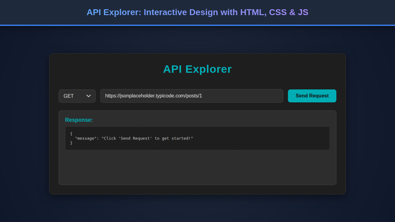
Final Output
Upon completing all the steps, you will have a fully functional and visually appealing interactive API Explorer. Key visual elements include the distinct dark theme, color-coded status badges for quick feedback, and tabbed input areas for a clean interface. The design emphasizes usability and clarity, ensuring a productive testing environment.
Users can intuitively select request methods, type in URLs, and craft detailed JSON headers and bodies. The response area will beautifully display the API’s reply, complete with syntax highlighting (if a library like Prism.js is integrated) and a prominent status indicator. It’s a testament to the power of HTML, CSS, and JavaScript when combined effectively.
Conclusion
Building an interactive API Explorer is a rewarding project that reinforces core web development concepts. You’ve learned how to structure a complex UI with HTML, style it with modern CSS, and empower it with dynamic JavaScript functionality. From handling user input to making asynchronous HTTP requests and presenting responses, you’ve covered a vast array of essential skills.
This tool isn’t just a demo; it’s a foundation. You can expand it with features like history, environment variables, or even integrate API Mocking: JavaScript Tutorial for Dev & Test to simulate server responses. Apply these techniques to other projects, build more robust tools, and continue exploring the endless possibilities of web development. Happy coding!